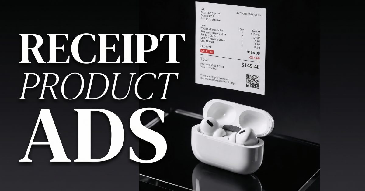
Receipt product ads are the kind of scroll-stopper that looks part packaging, part print design, and part social proof. The move is simple: stop treating the receipt as a throwaway detail and let it become the graphic spine of the image. That lines up with what typography ads have been doing for years, where type becomes the picture, and with the very practical idea that receipts already have unused ad real estate. I used Seedream V5 Pro Uncensored for the test frames below, then picked the strongest one for the cover.
Why does this look work so well? Because it gives the eye two jobs at once. First, read the receipt-like layout. Then, notice the product itself. That little delay creates motion in a static image. It also makes the product feel merchandised, not just photographed. For context, see Typography Ads: Inspiring Examples, Lessons & Trends, 6 Ways Retailers Can Use Receipts to Make More Money, and 29 Clever Ads That Play With Text And Typography.
Receipt product ads: why the look works
The strongest versions use a clean product, a crisp receipt strip, and one obvious contrast point. That can be color, lighting, material, or scale. The receipt can be literal, like a printed paper roll, or stylized, like a translucent label panel with totals, discounts, and tiny line items. Either way, the format feels familiar enough to read fast and unusual enough to stop the thumb.
For ecommerce brands, this is useful because it translates well across channels. One image can become a paid social creative, an email header, a collection banner, or a product page hero. It also works for launches and sale moments, since receipts already imply price, urgency, and purchase intent. You are not just showing a product. You are showing the moment someone decides to buy it.
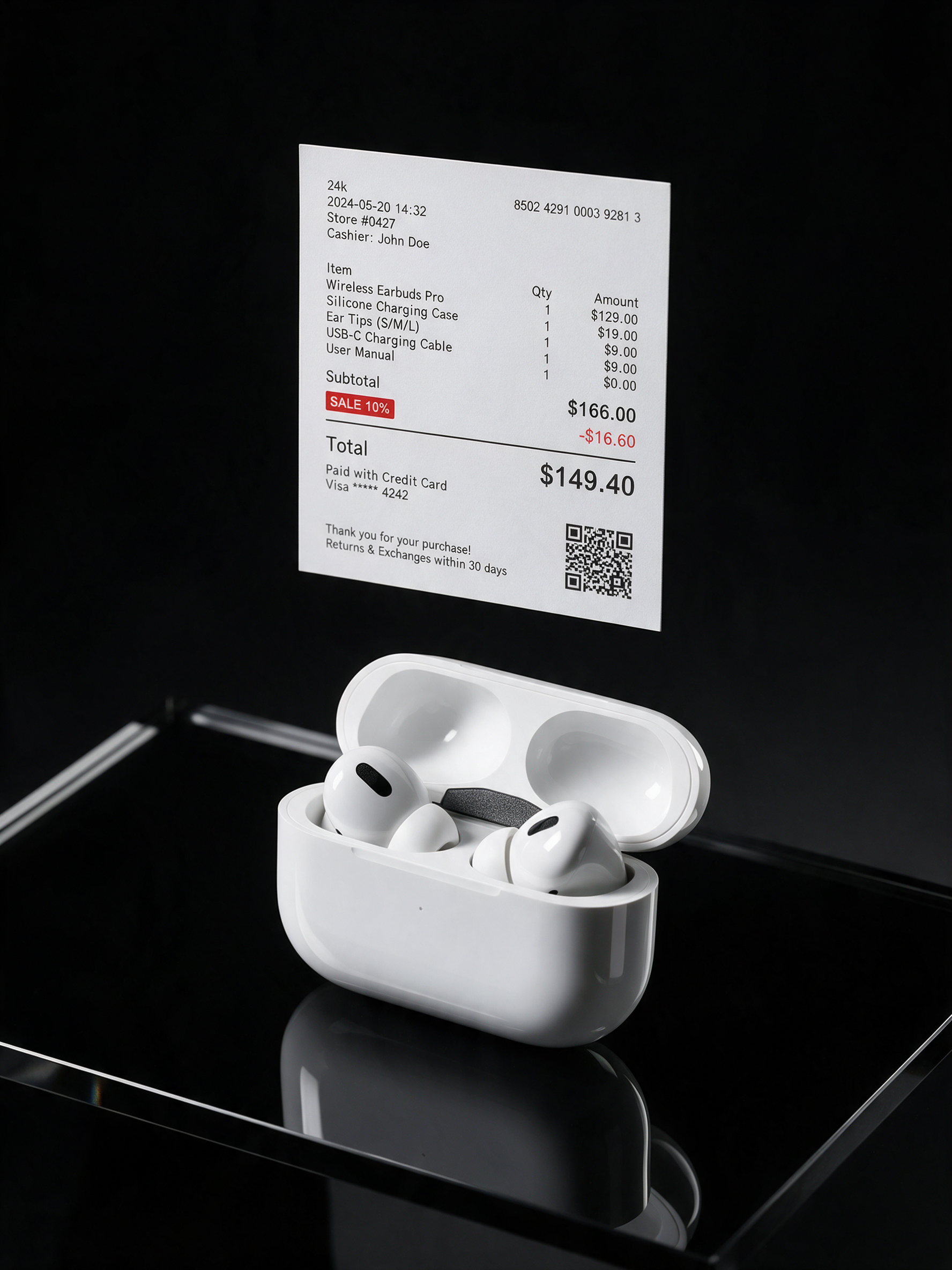
This one is the most immediate. The sneaker gives the scene energy, and the cobalt floor plus hot pink accents make the receipt strip feel designed, not pasted on. If you sell shoes, bags, or streetwear, this is the easiest place to start. The key is to keep the receipt shape long and obvious so it reads as a graphic element before the eye settles on the product.
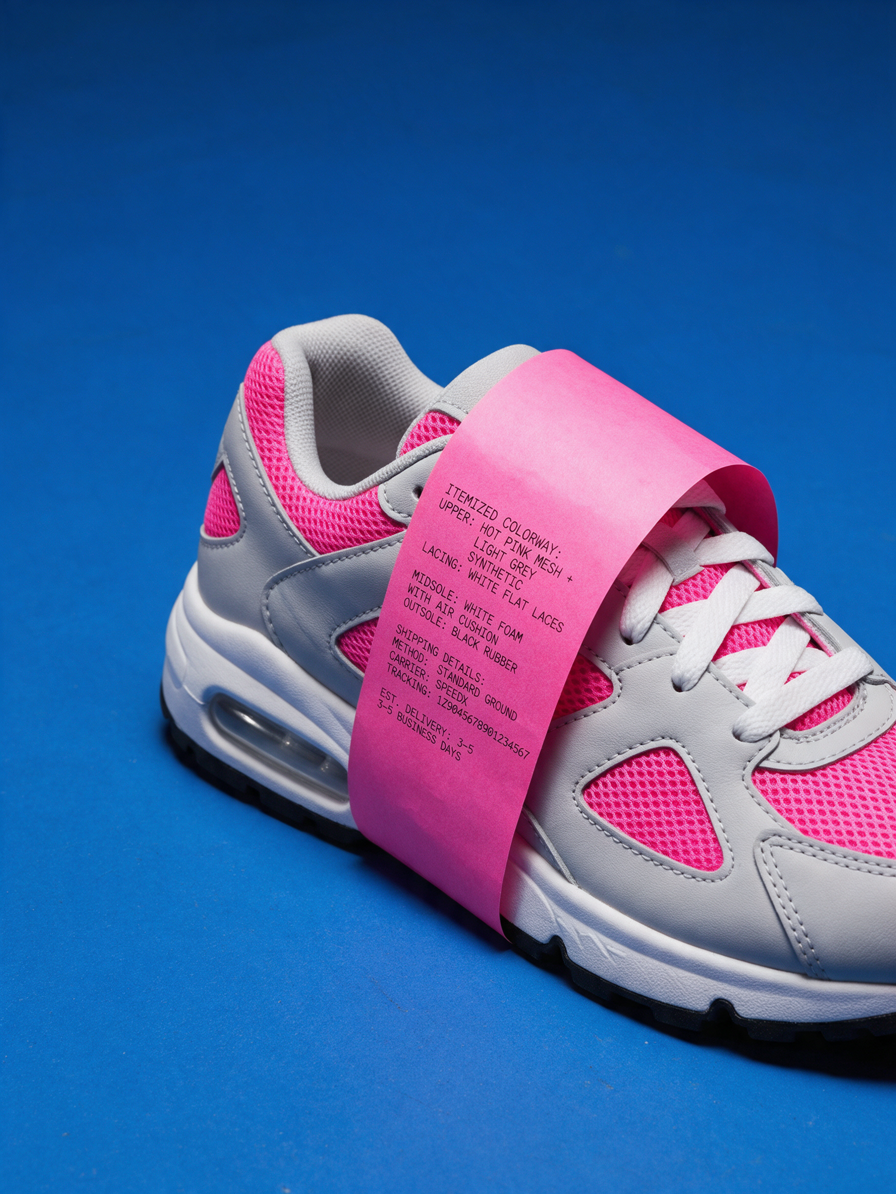
The skincare version is quieter, but that is what makes it work. Cream tones, stone texture, and soft daylight let the receipt act like a premium spec sheet. This is a good fit for serums, creams, supplements, and wellness products where the buyer wants clarity as much as drama. If you want a more expensive look, reduce the noise and let the paper texture do more of the talking.
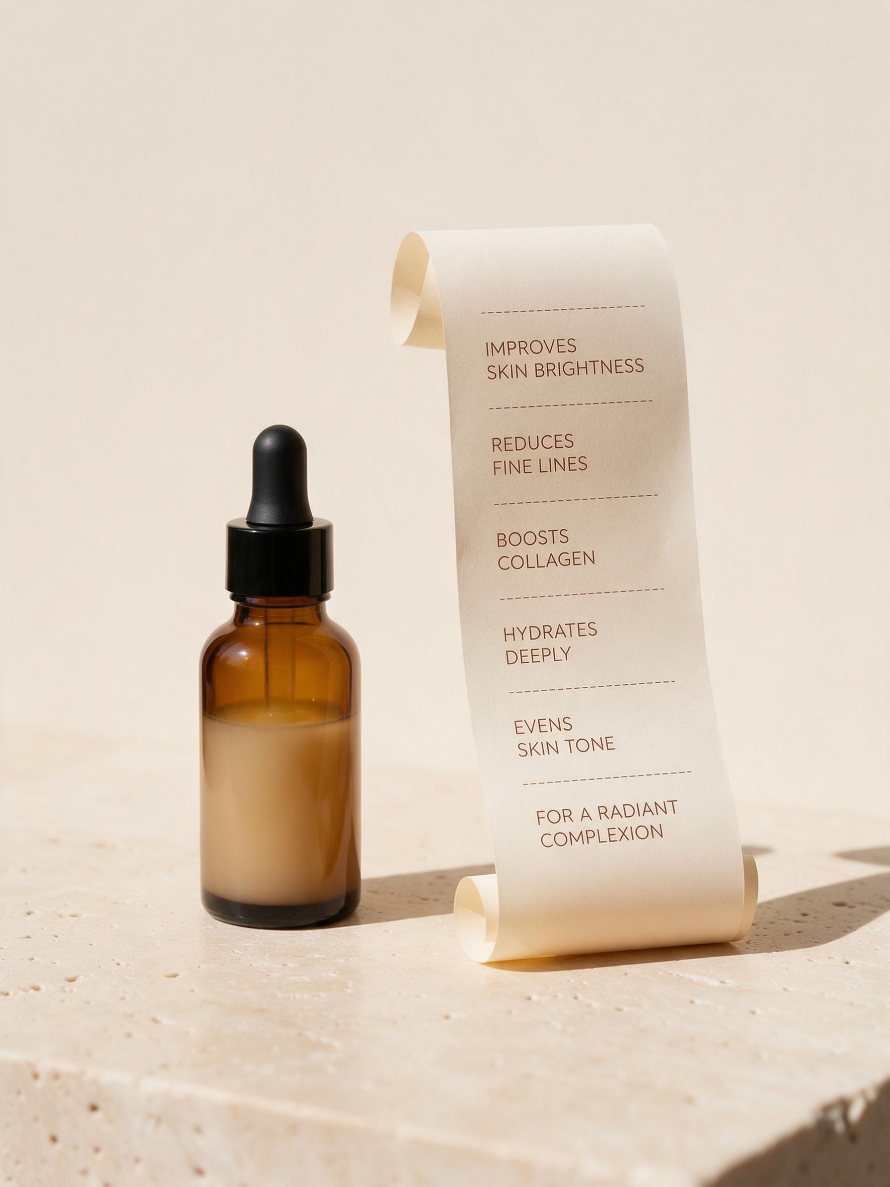
This is the hardest composition and the one that pushes the format most. The dense receipt card, tiny lines, and QR-style detail make the image feel almost like a smart checkout screen. It is a strong fit for tech accessories, tools, and accessories where the product itself is compact and benefits from a little visual structure around it. If the layout stays clean, this style can look very premium.
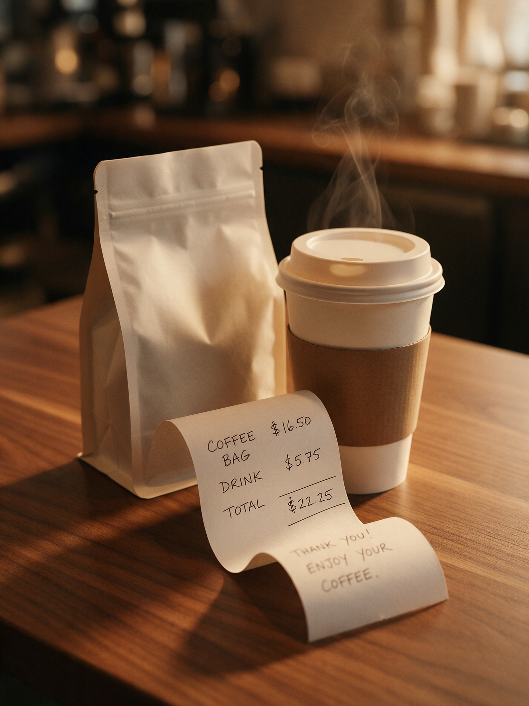
The coffee frame is softer and more everyday. The receipt becomes a curling paper trail, which keeps the ad from feeling too stiff. That works nicely for beverages, pantry goods, candles, and home products where the vibe matters as much as the object. It is also a good reminder that receipt product ads do not have to look cold. They can feel cozy, tactile, and still very commercial.
How to make receipt product ads without losing the product
Start with one accurate packshot and one clear design idea. Then keep the receipt information simple: a headline line, one or two item lines, a total, and maybe a small badge or QR element. Do not overload the image with fake paperwork. The product still needs to be the hero.
- Use one dominant color contrast, not three.
- Keep the receipt shape readable at thumbnail size.
- Let the product finish stay realistic and sharp.
- Use the receipt to imply price, urgency, or a launch moment.
If you are prompting this kind of look, a good formula is: clean product hero, receipt paper as the main graphic element, strong studio lighting, one accent color, realistic shadows, premium ecommerce ad, lots of negative space. Then vary the surface and mood from one example to the next. That gives you a set that feels related without looking copied.
Make this for your own products in VideoMagic
Turn a plain product photo into scroll-stopping video — free to start.