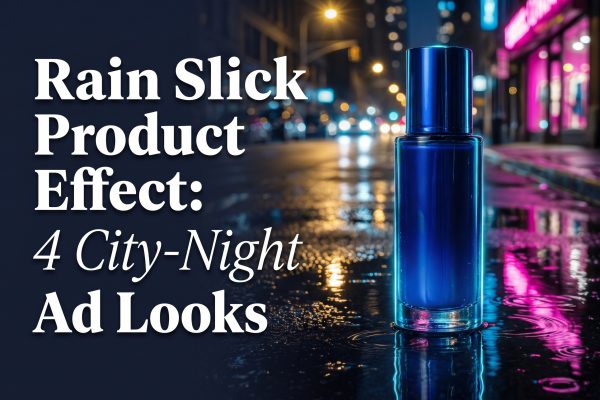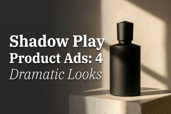
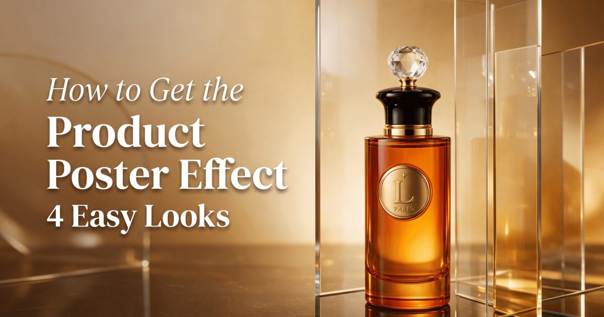
The product poster effect turns a plain packshot into a full ad scene. It works because one hero object, one bold color story, and one clear headline space make the image feel ready for a launch page, a paid ad, or a social post. Seedream 5.0 Pro handles this look well because it is tuned for text, structure, and polished product visuals.
- What the product poster effect is
- 4 product poster effect examples
- How to get the product poster effect
- When this look works best
- Fast prompt recipe
What the product poster effect is
The product poster effect borrows from billboard design and premium retail campaigns. The product sits in the center of attention, while lighting, shadows, and color do the selling. It feels simple at first glance, but the frame has to do a lot of work. The best versions leave enough breathing room for a headline, keep the silhouette clean, and avoid random clutter that fights the subject.
This is why the look keeps showing up in ecommerce ads. It makes one item feel bigger than its price tag. A skincare jar looks like a launch. A sneaker looks like a drop. A drink can looks like a campaign. That lift is the whole point of the product poster effect.
4 product poster effect examples
Each example below keeps the product in charge. That matters more than extra props or busy backdrops. The look lands because the frame feels designed, not accidental.
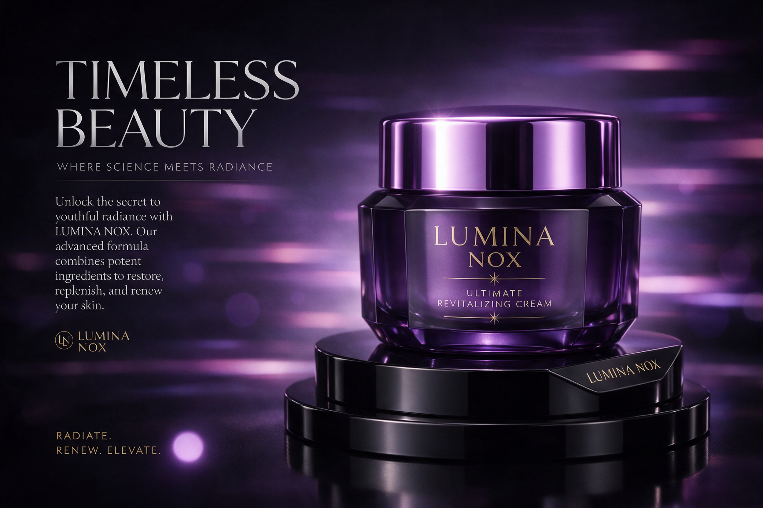
The first version goes quiet and premium. It uses dark contrast, a centered pedestal, and enough empty space to hold a headline without squeezing the product.
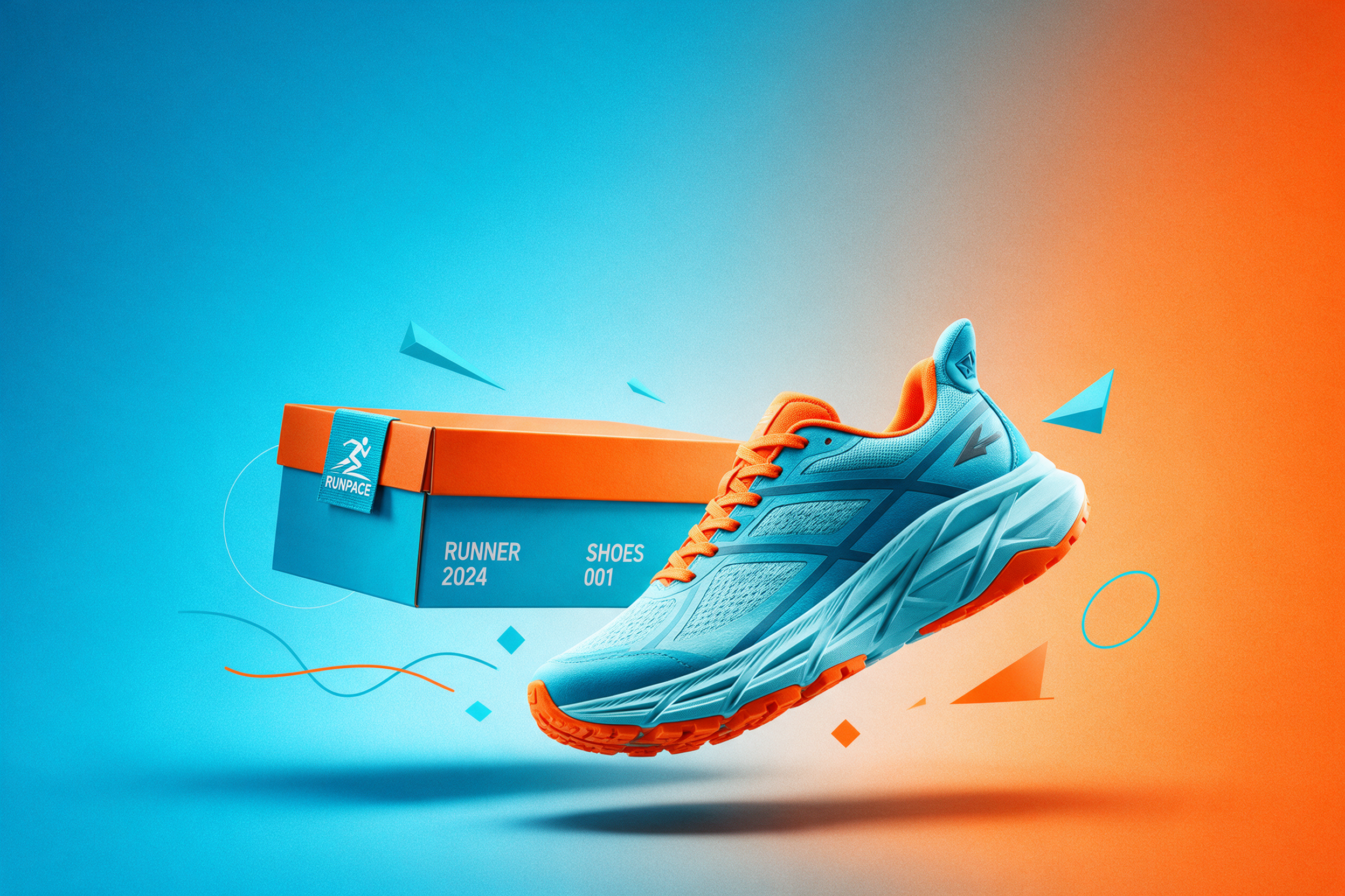
The sneaker version feels louder. It works because the colors carry the energy, but the layout still stays tidy. That balance is what keeps the product poster effect from turning into visual noise.
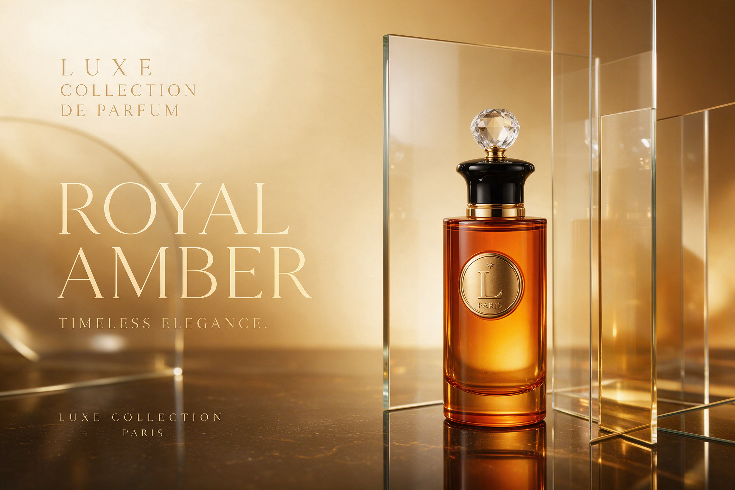
The perfume look is the most editorial of the group. It uses warm light and glassy reflections to feel expensive without adding extra props. This is the version that fits luxury, beauty, and premium gifting best.
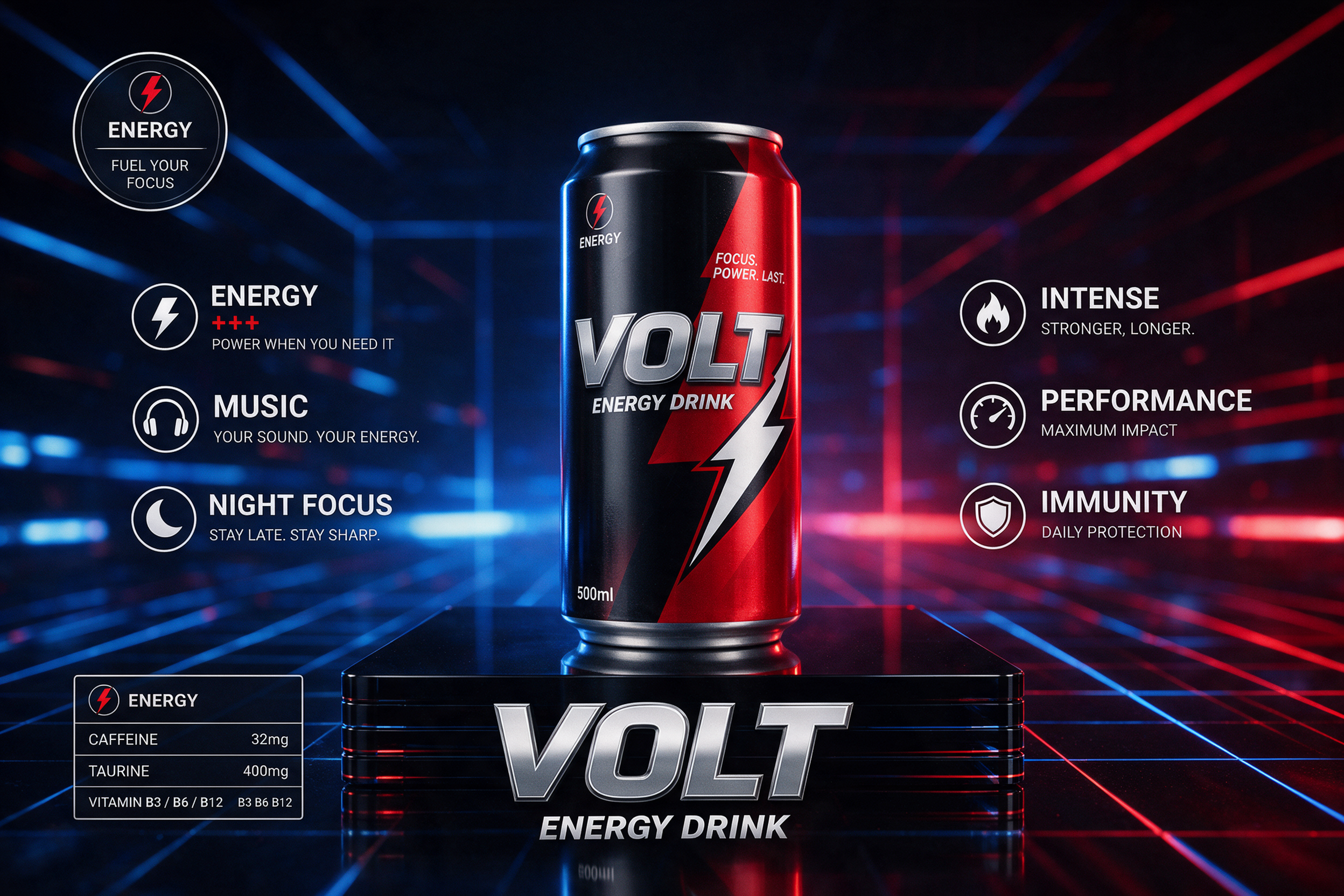
The final example pushes harder on motion and shelf impact. It feels built for a social ad, where the goal is to stop the scroll fast and make the packshot pop in one glance.
How to get the product poster effect
Start with one product only. If the frame is crowded, the poster feeling drops fast. Give the object a strong base, like a pedestal, acrylic block, or light reflection. Then leave one side of the frame open for type or a logo-free headline area.
Next, choose one color family and stick to it. Violet chrome, warm amber, icy blue, or neon grid all work. Mixing too many moods makes the ad look like a collage instead of a campaign. The product poster effect gets stronger when contrast stays tight and every element supports the same mood.
For a colder, more metallic version, see the Liquid Chrome Product Effect. It is a good match when the product needs a harder, shinier edge.
- Use one hero product.
- Keep the background simple.
- Leave real space for text.
- Use reflections with purpose.
- Keep the headline short.
When this look works best
The product poster effect works best when a brand needs instant polish. It fits launch posts, seasonal drops, marketplace hero banners, and paid ads that need more visual authority than a plain packshot. It also helps smaller brands look more established without a full studio setup.
It is especially useful for beauty, fashion, accessories, drinks, and small electronics. Those categories already sell on shape and surface, so the poster treatment gives them a cleaner stage. A good ad does not need more stuff. It needs a stronger frame.
Fast prompt recipe
A reliable prompt starts with the product, then adds light, surface, and layout. Use words that describe the commercial feel, not just the object. Think hero product, reflective base, premium campaign, strong negative space, and sharp editorial lighting. That gives the model a clear job.
Seedream 5.0 Pro is a strong fit for this because it handles text-rich and layout-heavy visuals better than many image models. The official page shows its focus on dense information, editing precision, and commercial imagery. For poster-style ads, that combination saves time.
The main lesson is simple. The product poster effect is not about stuffing the frame. It is about making one product look too good to ignore. Get the light right, keep the layout clean, and let the product do the talking.
Make this for your own products in VideoMagic
Turn a plain product photo into scroll-stopping video — free to start.