Product hero shot makeovers are the fastest way to turn a plain packshot into an ad that stops the scroll. The product stays the same. The surface, light, angle, and texture do the heavy lifting. These four examples were built with GPT Image 2.5 Sunburst Custom, which handles split scenes and clean product edits well.
Contents
- Why product hero shot makeovers work
- 4 product hero shot before and after examples
- How to get the look
- Where it fits best
Why product hero shot makeovers work
A flat packshot answers one question: what is it? A product hero shot answers a better one: why should someone care? The second frame has surface texture, harder light, and a stronger point of view. That is enough to make the same item feel more expensive, more tactile, and more ready for a launch post.
This style also gives a seller more room to test angles. One image can become a carousel cover, a short ad opener, or a homepage banner. For more texture-first ideas, see Tactile Product Photography and Liquid Chrome Product Effect.
The trick is not to add random props. It is to choose one strong material and one clear light source. Once those two choices line up, the product hero shot starts doing the selling for the frame.
4 product hero shot before and after examples
Each example below keeps the product readable and shifts the mood from plain to premium. The left side is the before. The right side is the after. That contrast makes the change easy to feel in a feed or in a store listing.
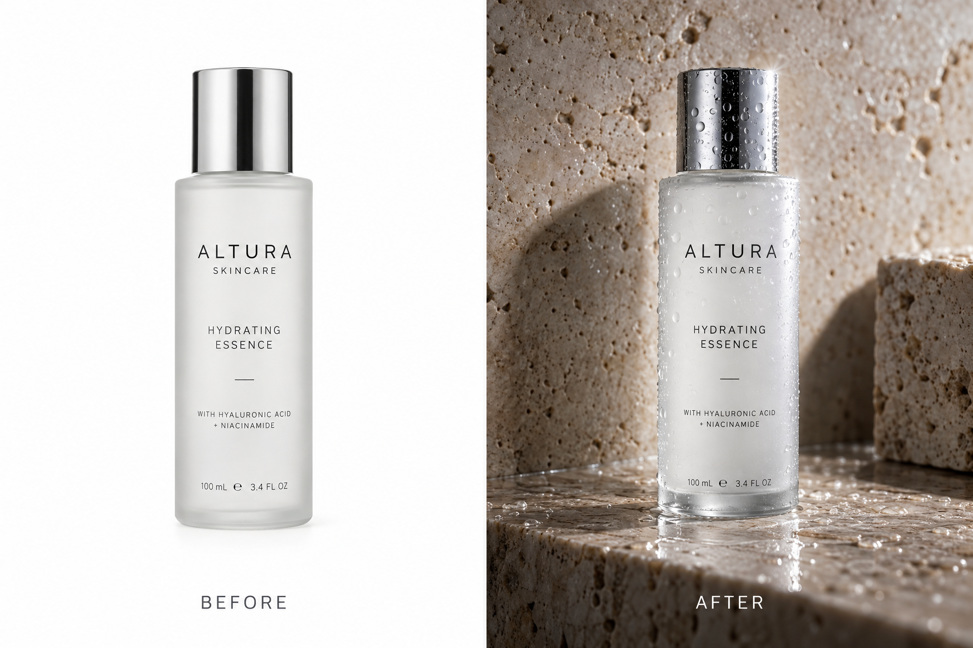
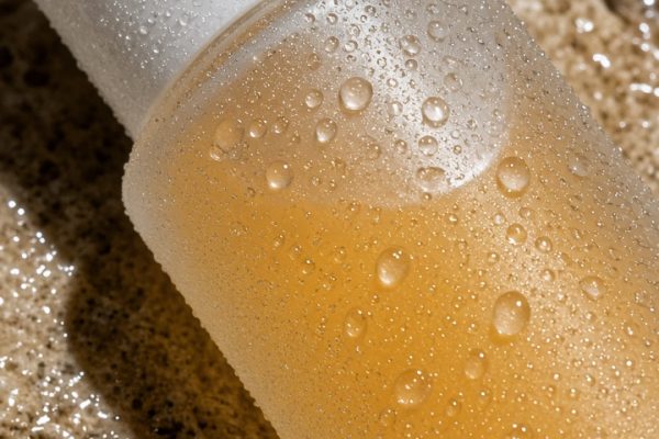
Skincare works because texture sells freshness. The plain shot says the bottle exists. The product hero shot says the bottle feels cool, polished, and worth a closer look. Water beads and stone give the eye a material story without hiding the label.
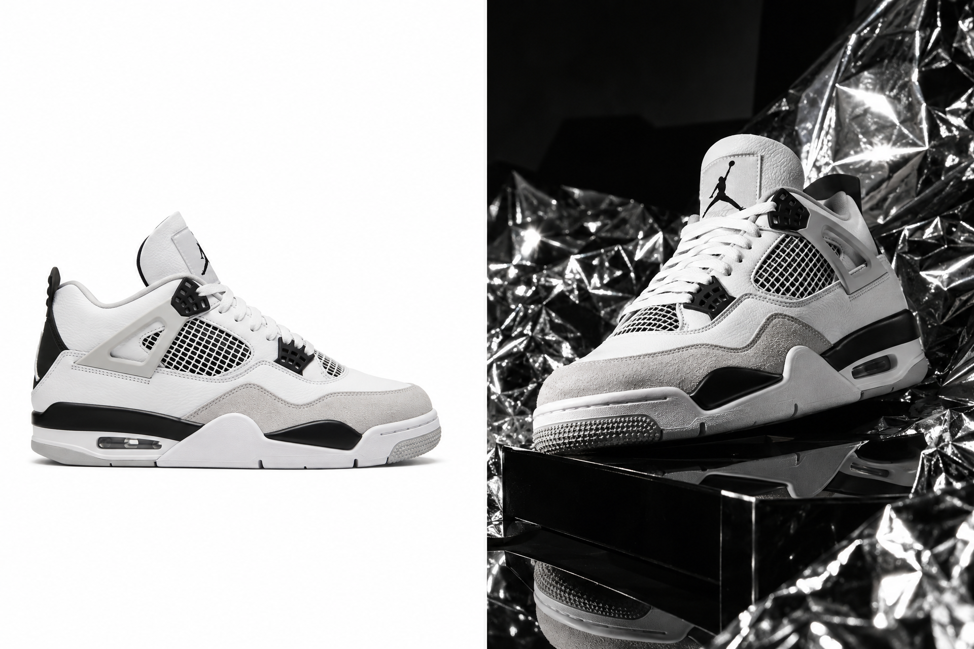
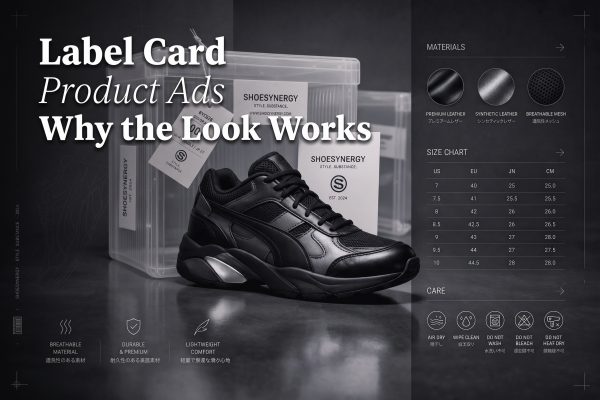
This is the classic product hero shot move for footwear. Keep the shape clear, then add one loud surface that creates energy. Crumpled silver and matte black do the job here. The result feels like a drop, not a listing.
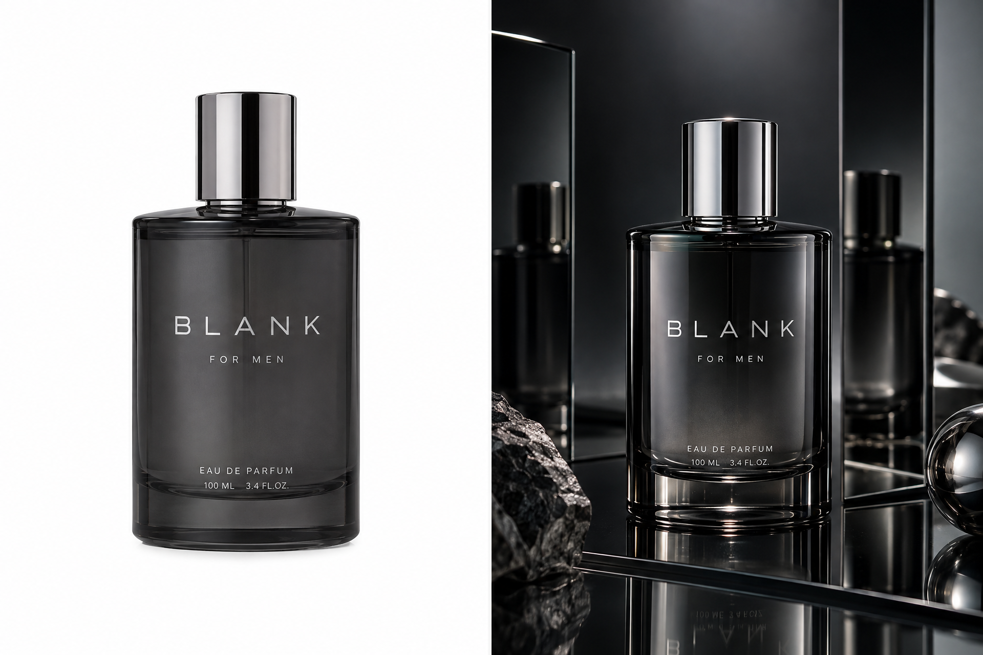
Fragrance is about atmosphere. The after image does not need more props. It needs a darker room, cleaner reflections, and a stronger edge on the bottle. That is enough to move it from shelf shot to premium campaign image.
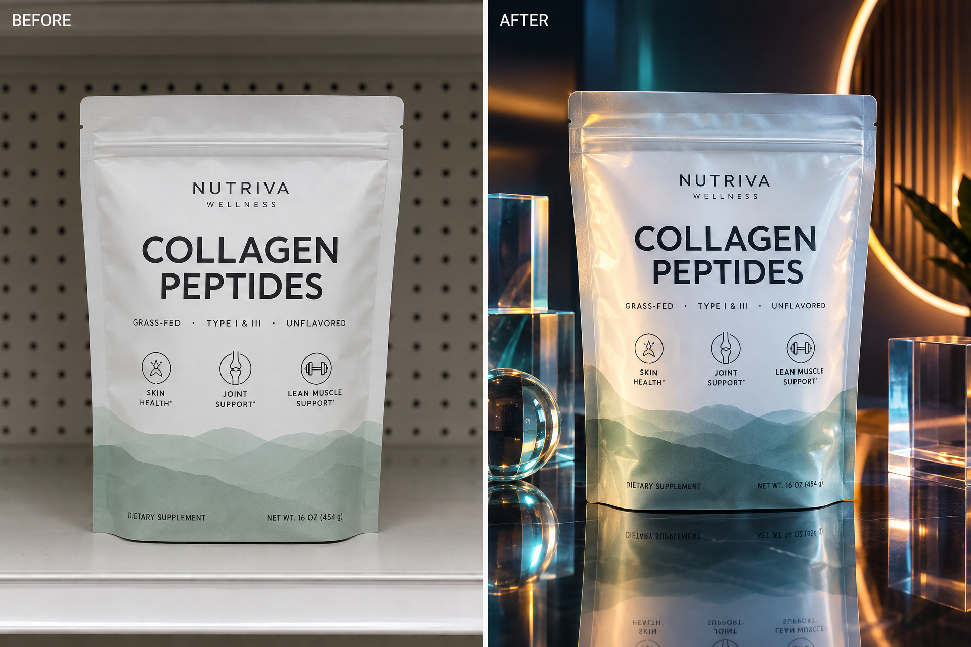
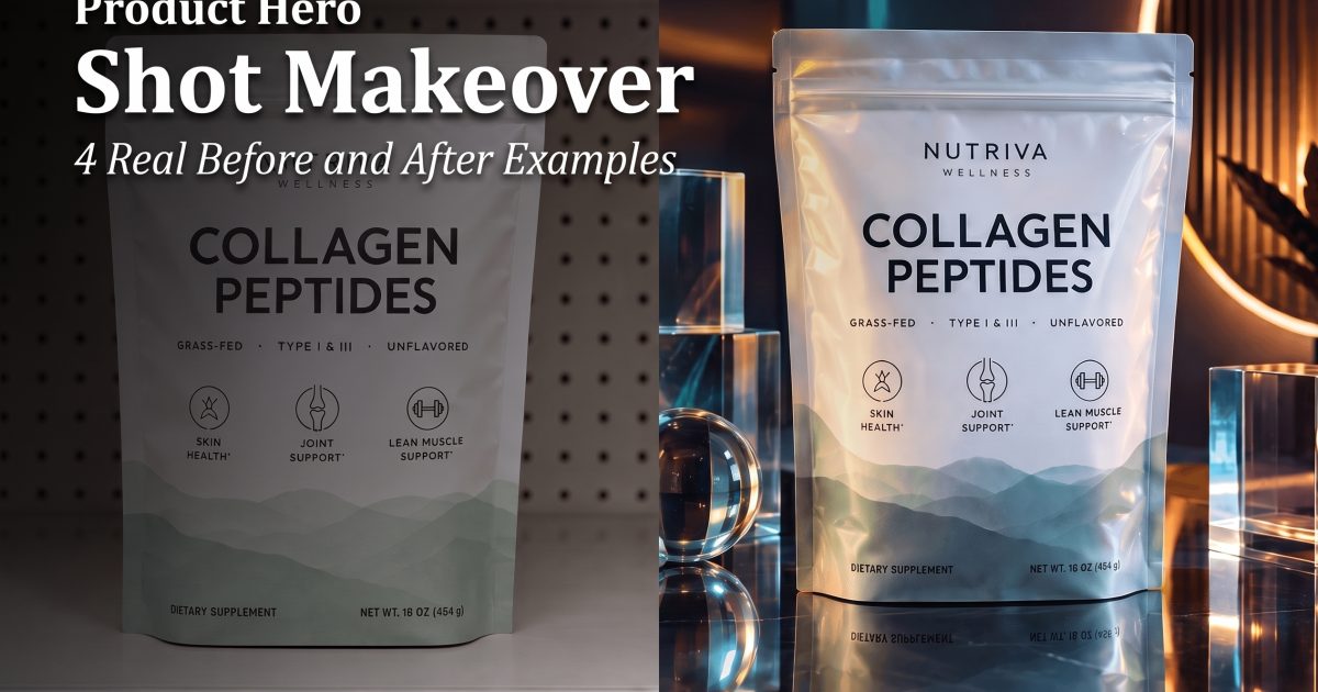
The supplement pouch is the toughest brief because too much shine can bury the label. A good product hero shot keeps the shape bold and the text readable while still adding drama. This is the kind of frame that works well on a landing page hero or a paid social test.
How to get the look
Start with one product and one transformation goal. Do not ask for everything at once. Pick a surface that says something about the product. Wet stone says fresh. Chrome says sharp. Acrylic says premium. Then decide how hard the shadow should be. Harder shadows usually give the shot more edge.
Keep the label or main shape as the sharpest part of the frame. If the eye has to hunt for the product, the image loses its job. This is why the best product hero shot images still feel simple. They are styled, but they are not crowded.
Use one image for the main ad, then make small variations for the rest of the campaign. Swap the surface. Change the light. Move the angle slightly. That keeps the look fresh without breaking the visual system.
Where it fits best
This format works best for launch posts, carousel covers, PDP headers, and ad tests. It is also useful when a product needs a more premium first impression before the shopper reads a single line of copy. For sellers who want the look without a full shoot, the fastest path is usually a clean packshot plus a stronger finish in VideoMagic.
The rule is simple. If the product feels ordinary on white, give it a better stage. A product hero shot does not need more noise. It needs better light, better texture, and a clearer reason to pause.
Make this for your own products in VideoMagic
Turn a plain product photo into scroll-stopping video – free to start.