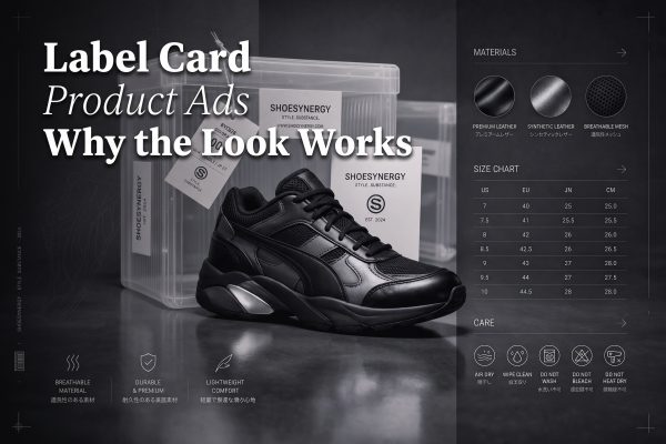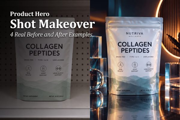
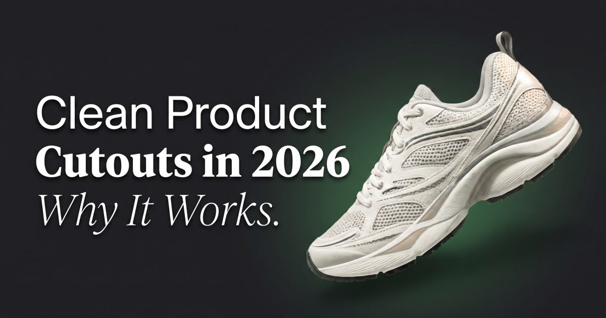
Clean product cutouts are back because shoppers read them in a second. The product sits alone, the shape stays sharp, and the ad feels ready for mobile.
This look is showing up in beauty, footwear, fragrance, and accessories because it clears away the clutter. A clean cutout gives one item a loud first frame without asking for a full photoshoot set. That is also why it pairs well with more polished effects, like the liquid chrome product effect, when a brand wants one simple visual hook.
The examples below were built with a model that handles transparent backgrounds and tight edits well: GPT Image 2.5 Flare Custom.
- Why clean product cutouts are everywhere
- What makes clean product cutouts feel premium
- 4 clean product cutout examples
- Where the trend goes next
Why clean product cutouts are everywhere
Feed content has a very short window now. A product cutout gives the eye one thing to solve fast, which is useful on a small screen. There is no extra set to decode, no busy tabletop to read, and no background props fighting the label.
That makes the look flexible. A skincare launch can feel clinical and calm. A sneaker can feel sharp and street-ready. A fragrance bottle can feel premium without losing clarity. The same visual idea can move across categories because the frame does not depend on one scene.
There is also a practical reason. Sellers need assets that work in ads, product pages, email banners, and social posts. Clean cutouts travel well because they stay readable at different sizes. The same image can open a Reel, sit beside a product title, or work as a simple ad tile.
What makes clean product cutouts feel premium
The best versions do not look empty. They look edited. That means the silhouette stays crisp, the shadow lands in the right place, and the background has enough tone to keep the product from floating flat.
Three things usually do the heavy lifting:
- One strong silhouette with no visual noise around it.
- A controlled shadow that gives the product weight.
- One color field or glow that frames the item instead of decorating it.
Texture helps too. A glossy bottle, a matte tube, or a mesh sneaker all read differently once the background gets stripped back. That is why this look sits close to product photography, but still feels trend-led. It is clean enough for ecommerce and stylized enough for social.
If more surface detail is the point, the newer tactile product photography look pushes the other way. It leans into texture. This cutout trend leans into clarity.
4 clean product cutout examples
These four examples show how the same idea changes across categories. The product stays isolated, but the mood shifts fast.
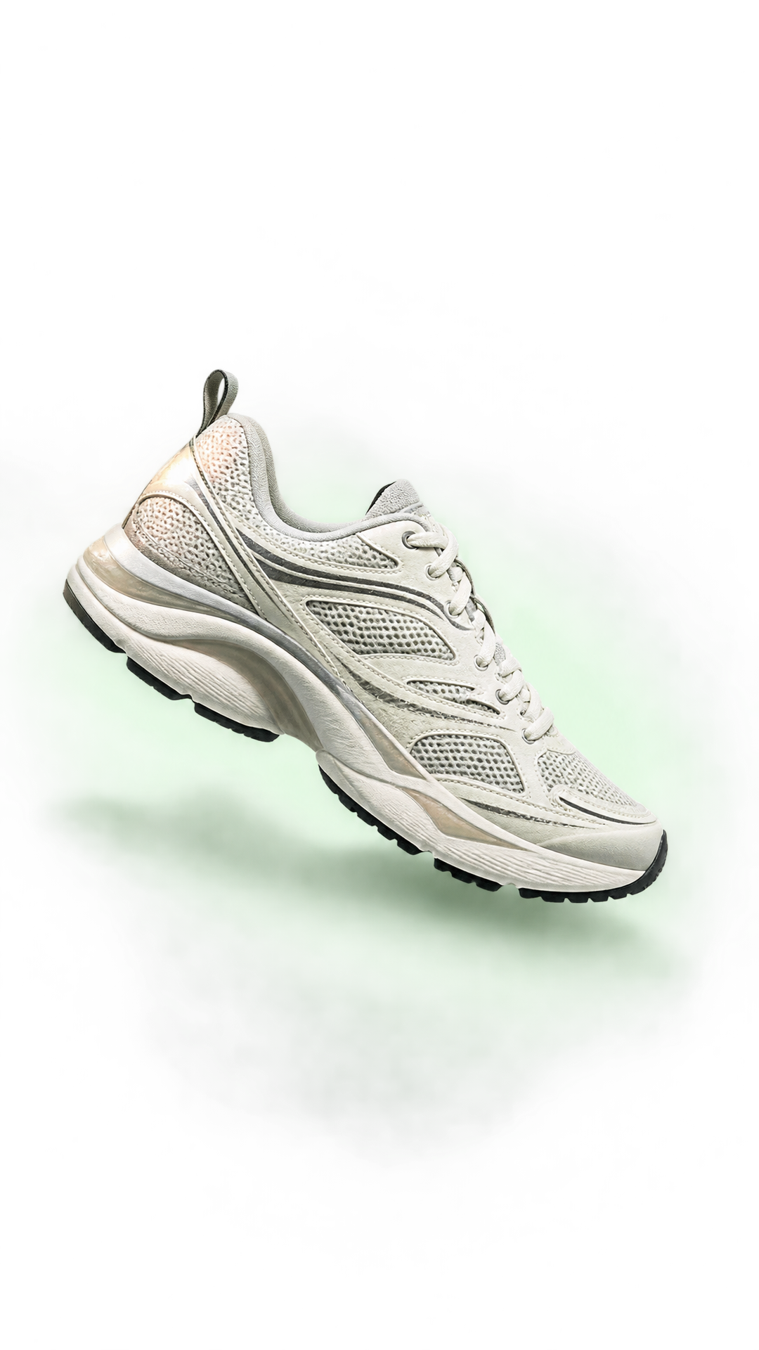
The sneaker version feels the most social-first. It has movement, contrast, and enough negative space to work as a hero frame. This is the one that stops the scroll fastest.
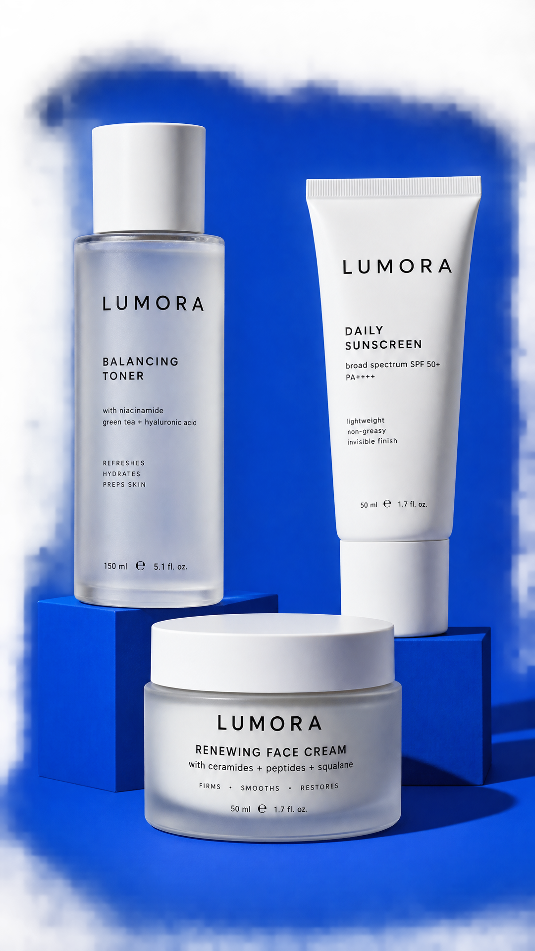
The skincare set is more commercial. It feels like a launch banner, a homepage tile, or a paid ad with room for copy. The grouped layout makes it feel more complete without getting busy.
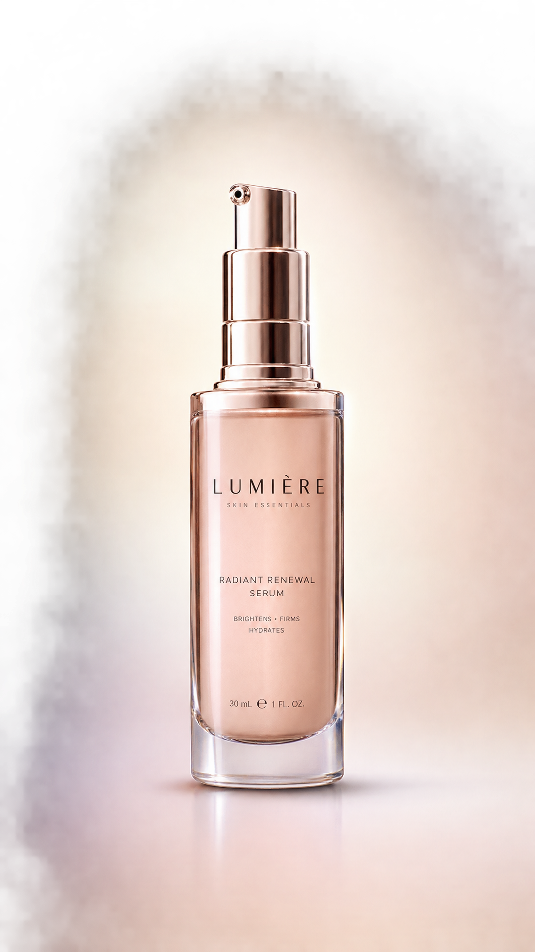
The serum bottle is the calmest version. It leans premium, clean, and shelf-ready. This is the sort of image that works well on a product page where clarity matters more than drama.
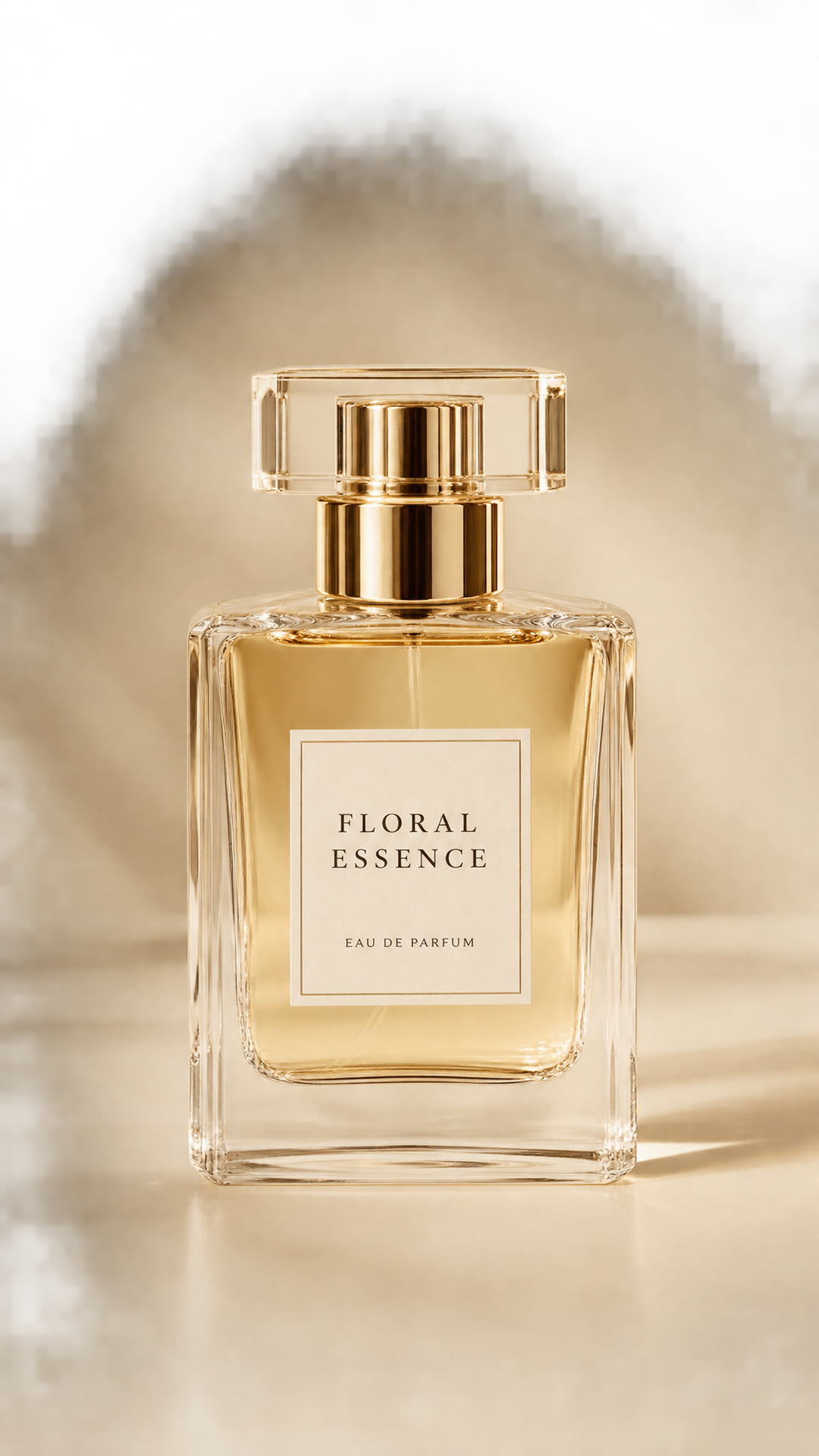
The fragrance shot sits between editorial and ecommerce. It keeps the bottle sharp, but the lighting gives it a little luxury. That balance is why this trend works across price points.
Where the trend goes next
Clean product cutouts will probably keep getting simpler. The next wave looks less like full scenes and more like reusable assets. Brands want images that can move between ads, product cards, launch pages, and quick social tests without a new shoot every time.
Expect more transparent backgrounds, tighter object control, and stronger color blocking. Expect more pairings with motion too, especially when a clean still becomes the base for a video reveal. The trend is not about removing personality. It is about making the product easier to read before the scroll moves on.
If the goal is a more stylized reveal, the same feed can still swing toward chrome, fabric, or flash-heavy detail work. If the goal is clarity, clean product cutouts win.
Make this for your own products in VideoMagic
Turn a plain product photo into scroll-stopping video — free to start.