Label card product ads are showing up because they make one product feel curated, not crowded. The card does the heavy lifting. It gives the eye a place to land, adds context fast, and makes a packshot feel like a real campaign. The same audience that clicks Liquid Chrome Product Effect and Floating Fabric Product Effect usually reads this style in seconds.
On this page:
Why label card product ads are catching on
Label card product ads fit the mood of 2026. Adobe’s 2026 design trends point toward exaggerated text, immersive layouts, and more human, tactile design. VistaPrint’s graphic design trends 2026 say the same thing in a different way: brands with personality and a sense of imperfect realness stand out. This look gives product visuals that personality without making them noisy.
ByteDance’s Seedream 5.0 Pro is built for dense layouts and better text rendering, which makes this kind of ad easier to mock up. Its own design blog says the model handles information-rich composition, structural coherence, and text rendering more cleanly than older image tools. That matters here because the card is not decoration. It is part of the message.
There is also a simple commercial reason this works. The card turns a product shot into a story. A serum can feel clinical. A coffee tin can feel crafted. A sneaker can feel technical. The label card tells the shopper what kind of object they are looking at before they even zoom in.
4 label card product ad looks to try
Each of these label card product ads leans on a different mood. The layout stays simple, but the tone changes. That is the trick.
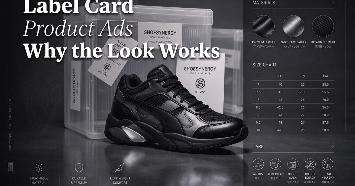
1. Technical sneaker spec card
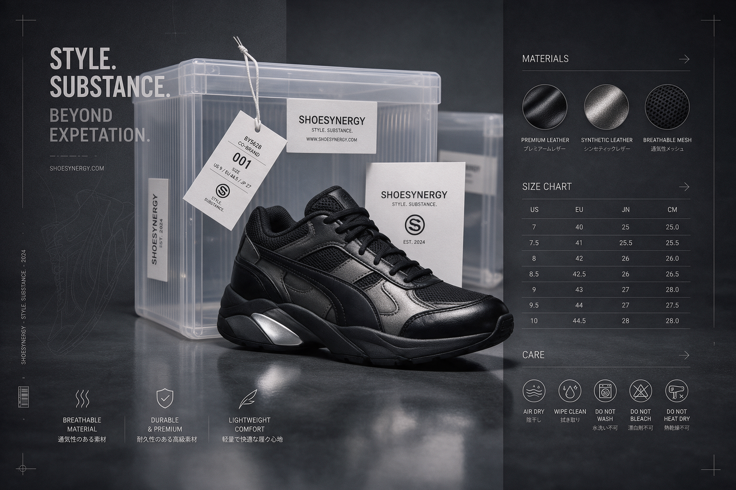
This is the most useful version of label card product ads for performance marketing. The product stays central. The card adds facts without making the frame feel crowded. It works for footwear, bags, gear, and any product that needs a quick read on materials or fit. The clean grid also makes the ad feel more expensive than it is.
2. Coffee roast note card
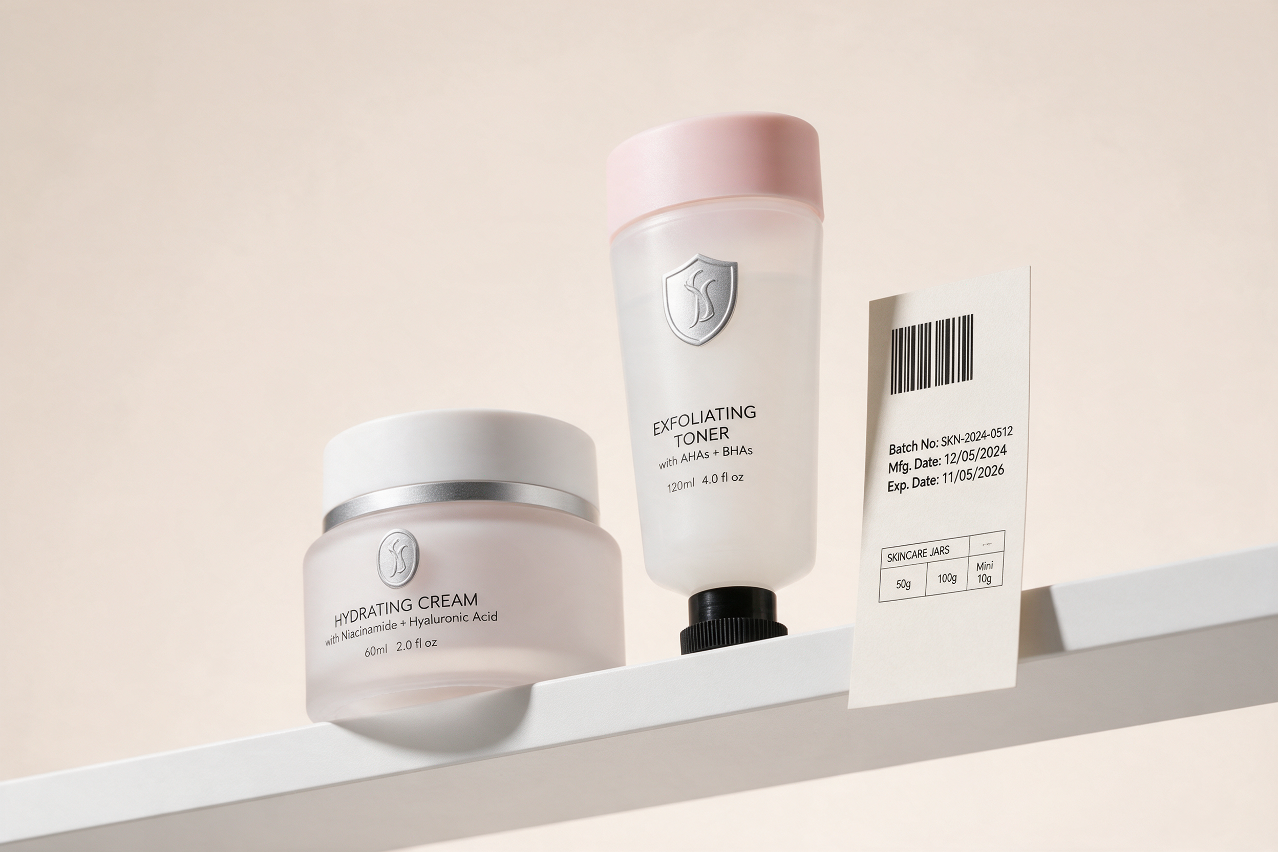
This version leans into craft and texture. It is good for food, drinks, candles, and anything sold as a sensory object. The label card product ads format makes the product feel named, not just shown. That shift matters. Shoppers tend to trust a layout that gives them a few useful details fast.
3. Minimal serum card
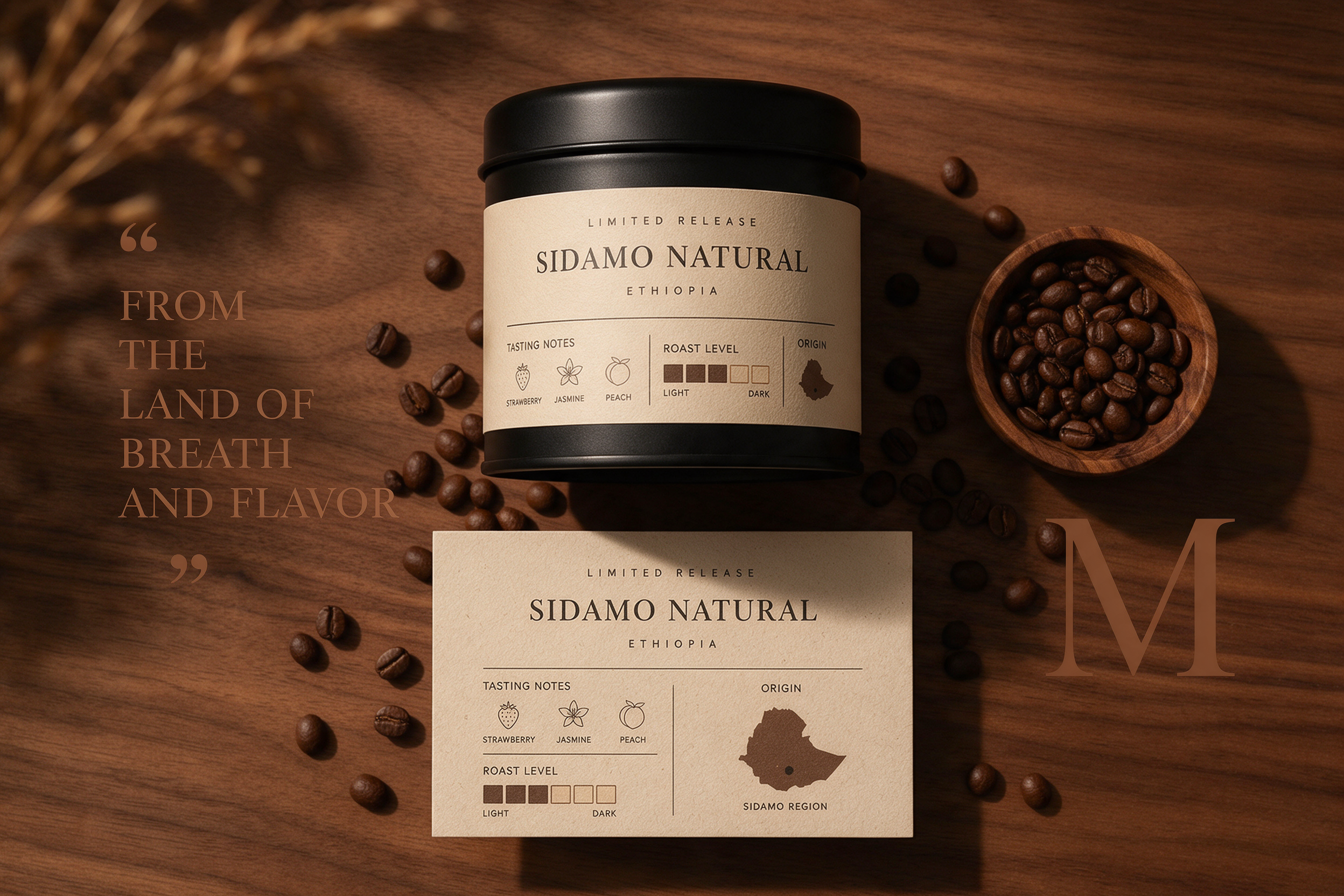
This is the cleanest take on label card product ads. It is best for skincare, supplements, wellness, and any brand that wants the ad to feel calm first and clever second. The card should stay short here. Too much copy kills the mood. A few ingredients, a benefit line, and a strong product silhouette are enough.
4. Compliance card beauty set
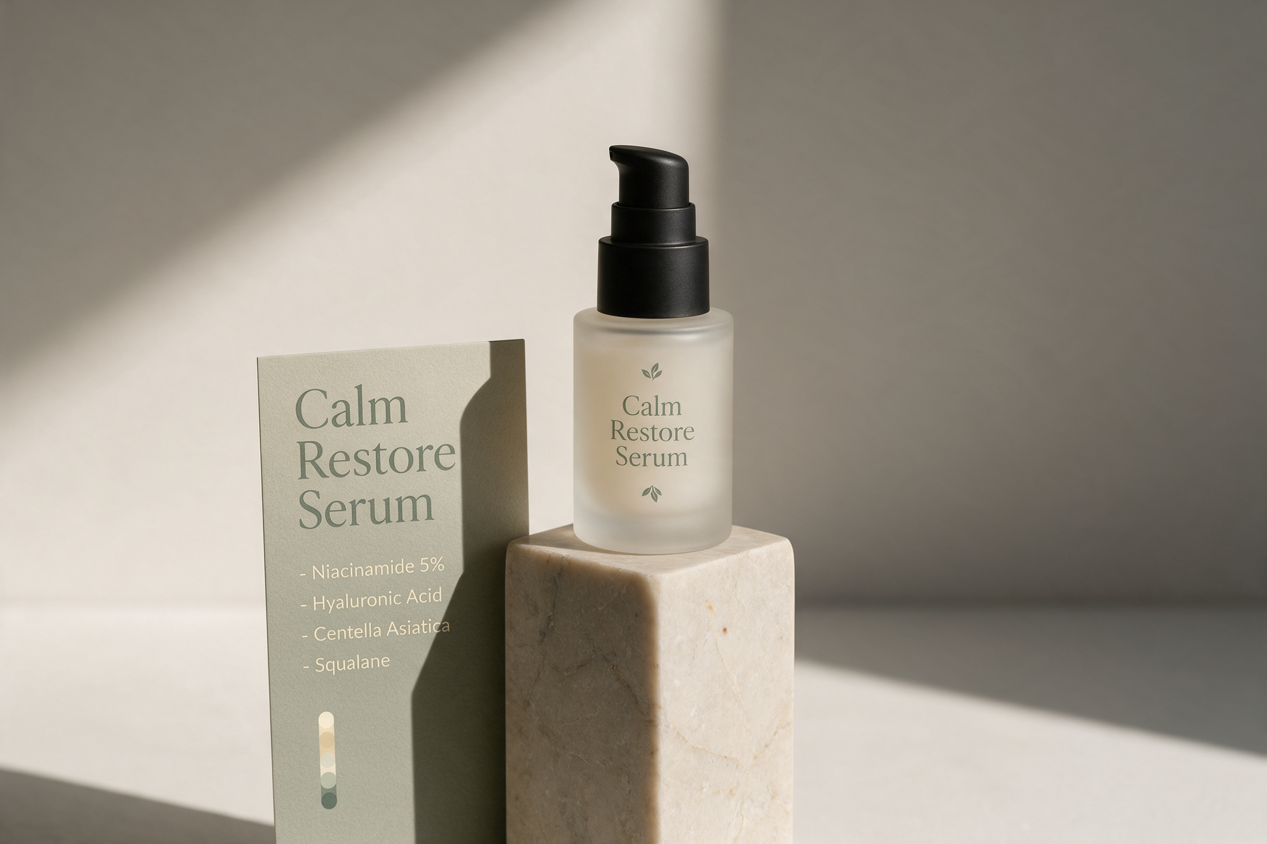
This one works when the ad has to carry more information. It is a little busier, but the layout still feels intentional. That makes it useful for bundle offers, retail proof, or products with more than one item in frame. The key is to keep the card aligned and let one hero object win.
How to make label card product ads
Start with one product and one card. Then assign jobs. The product should sell the feeling. The card should sell the facts. Keep the background quiet. Use one palette. Use one main type style. If the scene starts to feel messy, remove copy before removing the product. That usually fixes the composition faster than changing the whole prompt.
- Say where the card sits: left, right, above, or floating.
- Tell the model what the card contains: name, notes, chart, barcode, icons, or ingredient list.
- Choose a material mood: paper, foil, stone, glass, wood, or matte plastic.
- Pick one lighting style: soft daylight, warm studio, glossy retail, or dramatic editorial.
- Keep the product description simple so the card can do its job.
Seedream 5.0 Pro handles this look well because it can hold text, layout, and object structure in the same frame. That is exactly what label card product ads need. The result should feel like a real ad people would save, not a random image with text on top.
If the first render feels too crowded, cut the card copy in half and rerun it. If the layout feels too plain, add one tactile cue such as paper grain or a small shadow lift. The best label card product ads look designed, not generated.
Make this for your own products in VideoMagic by turning a plain product photo into a scroll-stopping video. Free to start.
Make this for your own products in VideoMagic
Turn a plain product photo into scroll-stopping video — free to start.