
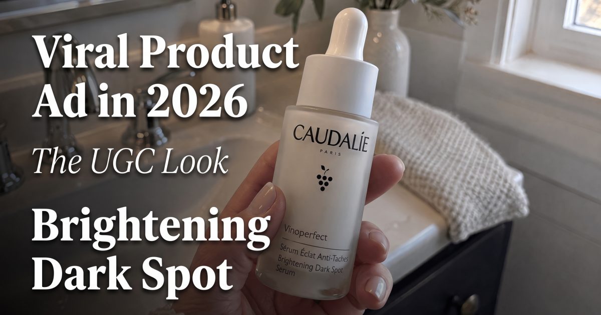
Viral product ad is the look that feels like a real creator recommendation. The product sits in an ordinary room, the hand stays in frame, and the pitch lands before the viewer has time to swipe.
That is why the format keeps winning. Shopify’s UGC ads guide treats creator content as social proof, and TikTok’s creative guide keeps pushing clear hooks and fast story beats. A viral product ad does both in one frame.
What this viral product ad look is doing
The best viral product ad does not try to look expensive first. It tries to look familiar. The product sits in a phone-shot room, the hand stays in frame, and the pitch lands before the viewer has time to swipe. The viewer should feel like the clip came from a kitchen, a bathroom, a car, or a bedroom mirror. That setting matters because it lowers the distance between the product and the buyer.
Polish still matters, but the polish should live inside the product, not around it. Sharp label. Clean light. Real hands. One clear action. That mix makes the ad feel native without turning sloppy.
Three frames that keep the viral product ad believable
| Frame | What it signals | Best use |
|---|---|---|
| Bathroom counter close-up | Routine and trust | Skincare, hair care, supplements |
| Kitchen table unboxing | First impression | New launches, bundles, gifts |
| Mirror selfie with a messier background | Lived-in authenticity | Beauty, personal care, daily-use products |
Bathroom counter close-up
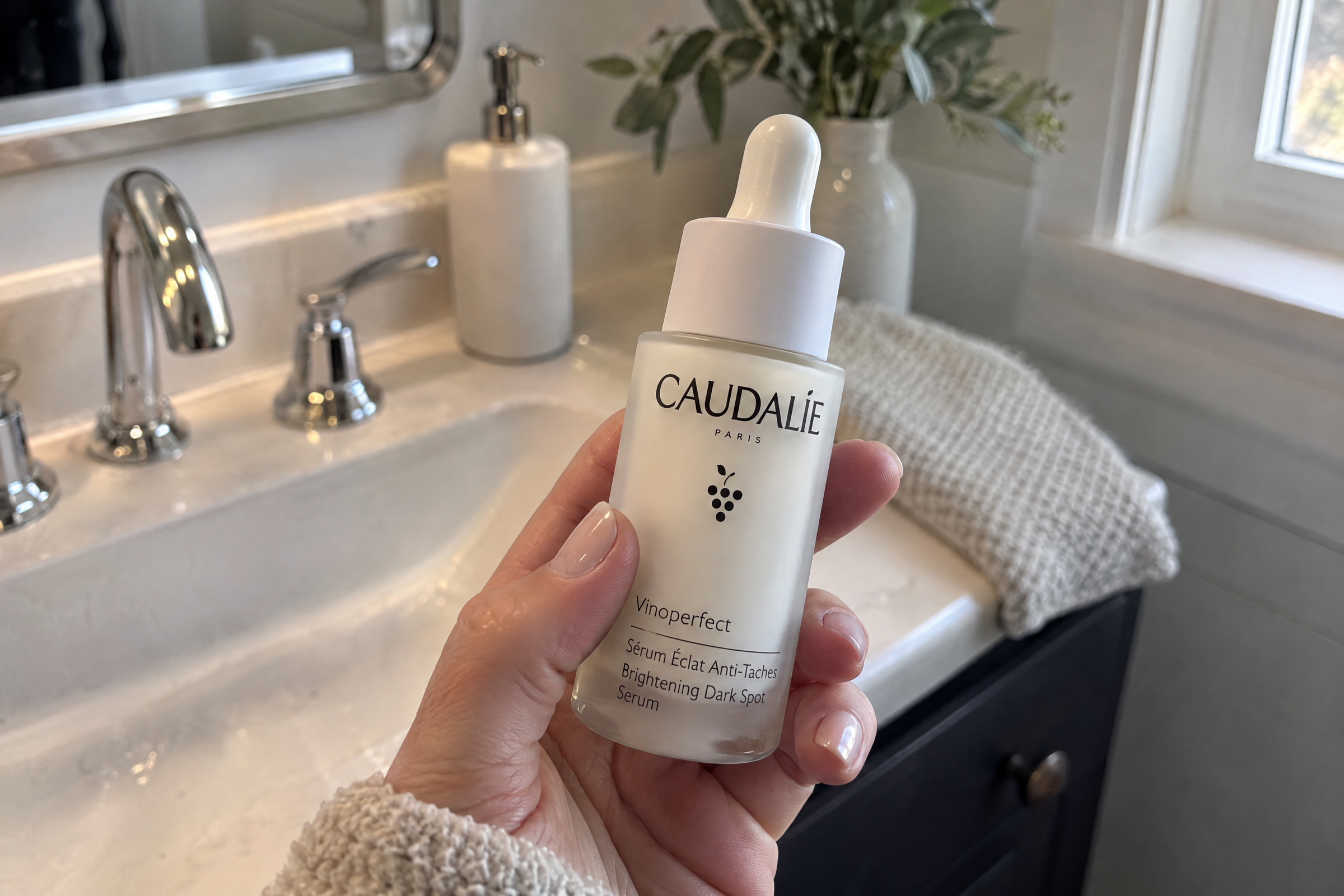
This viral product ad frame feels strong because it looks like a quick morning routine. The product stays close enough to read, and the hand gives scale without pulling focus. It works for anything that gets used often and explained fast.
Kitchen table unboxing

Unboxing adds a simple promise: newness. This viral product ad frame works because the box, the cap, and the first reveal do the work. If a launch needs energy without a big set, this is one of the safest ways to get it.
Mirror selfie with a messier background
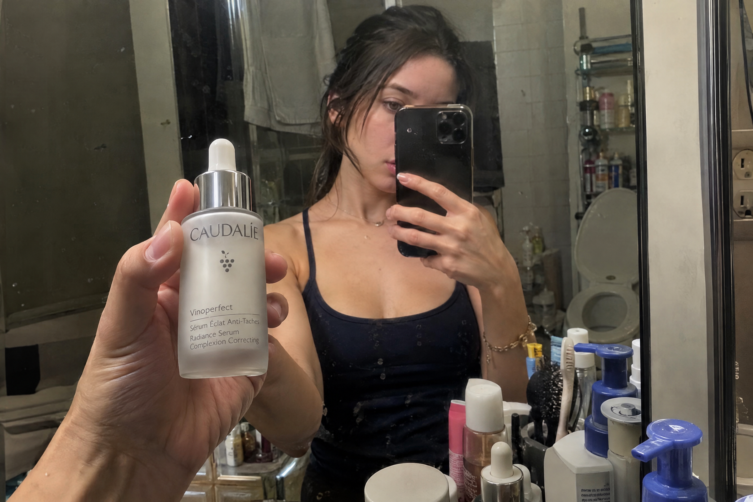
This viral product ad frame is the hardest one to fake well, and that is why it can work. Real mirrors are not perfect. Real bathrooms are not empty. A little clutter makes the ad feel borrowed from a real life moment instead of built in a studio.
How to build a viral product ad without overpolishing it
For a viral product ad, start with one product and one action. That is enough. A hand can twist the cap, lift the bottle, open the box, or hold the item beside the face. The motion should be small. The buyer only needs a reason to believe the product belongs in daily life.
Keep the background useful, not decorative. A counter, sink, table, or mirror gives context. Then keep the label readable. If the product becomes hard to identify, the ad starts losing its job.
- Use soft natural light when the product needs to feel honest.
- Use mixed room clutter when the shot needs a stronger creator feel.
- Keep the first second simple so the product appears fast.
- Save the strongest claim for the end of the frame.
That same idea shows up across the stronger examples in Handheld Product Story and Retro VHS Effect. One leans into routine. The other leans into nostalgia. This viral product ad look sits in the middle. It borrows trust from everyday life.
What changes next
The next wave of creator-style product ads will probably feel even less staged. More real rooms. More imperfect hands. More product-in-use moments. Less fancy lighting. Less empty space. That shift helps small brands because the ad no longer needs to look like a production.
For testing, try one clean frame and one messy frame. Try one close-up and one wider scene. Try a version with the product already in hand. The better ad is usually the one that feels slightly too ordinary to be an ad.
If the product still reads clearly, the viral product ad look is doing its job.
Make this for your own products in VideoMagic
Turn a plain product photo into scroll-stopping video – free to start.