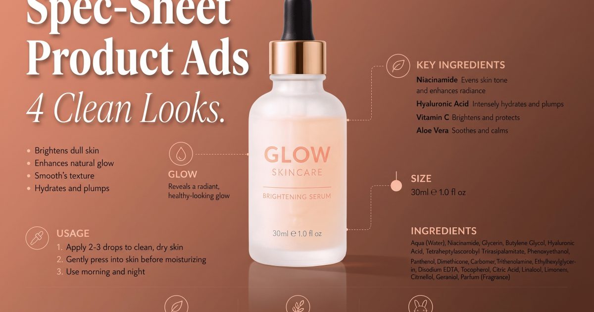
Spec-sheet product ads make a plain listing feel like a premium launch page. The product stays simple. The layout does the selling. Short callouts explain size, ingredients, weight, battery life, or material in a way the eye can scan in a second. That matters for shoppers who skim before they click. It also fits marketplace ads, landing pages, and social posts that need one clear visual idea.
This look works because it answers objections early. Buyers do not have to guess what the item does or what makes it different. They see the hero product, then a small stack of facts. That mix of beauty and proof is why spec-sheet product ads keep showing up in product ad feeds. The official Seedream 5.0 Pro page is a good sign of how far dense layout generation has come.
How to build spec-sheet product ads that convert
Start with one product and one promise. Keep the labels short. A lot of these designs fail because they try to say too much. The best spec-sheet product ads feel tidy, not crowded. They leave enough white space for the eye to rest, and they give the product a clear place to breathe.
The safest formula is simple. Show the hero item first. Add three to five useful facts. Use one accent color, one font family, and one visual rhythm. If a detail does not help the shopper decide, cut it. Price can live on the page around the image, not inside the image. That keeps the graphic cleaner and easier to reuse across channels.
- One hero product.
- One promise or angle.
- Three to five callouts only.
- One accent color.
- Short labels that read fast.
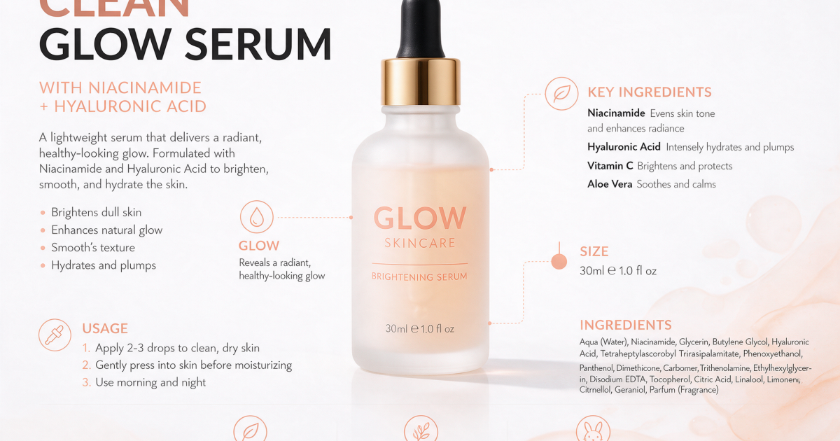
The skincare version works because it feels calm and precise. Soft tones help the product look expensive. The callouts carry the details. A buyer can read the benefits, the size, and the claim without hunting for them. That is the core of spec-sheet product ads. The product feels clear before it feels clever.
There is also a trust angle here. When the ad shows ingredients, size, and usage in the same frame, the shopper gets fewer surprises later. That can lift click quality as much as it lifts clicks. The format is not only pretty. It removes friction.
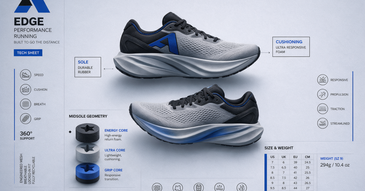
The sneaker version can take more contrast. Bold black, cobalt, and grey make the shoe look sharper. Technical notes feel natural when the product has foam, tread, weight, or fit details worth calling out. This is where spec-sheet product ads get useful for sports, fashion, and everyday retail. The layout gives each detail a job.
If the product is more style-driven, keep the text smaller and the negative space larger. If the product is more technical, give the labels more weight. Either way, the structure stays the same. The image sells the feeling. The callouts sell the proof.
4 looks that make spec-sheet product ads feel fresh
The same format can look very different depending on the category. Skincare wants soft tones. Sneakers can take stronger contrast. Coffee likes warm texture. Tech gear works best with dark surfaces and sharp grids. That variety keeps the format from feeling repetitive, even when the layout stays almost the same.

The coffee version leans into warmth and texture. It feels handmade but still reads like a sales asset. That balance works well for food, beauty, and anything where origin or process matters. A clean label, a short benefits line, and one supporting note can carry the whole frame.
It also shows why spec-sheet product ads are not limited to sterile catalog work. A good layout can feel human. It can carry a mood. If the product has a story, the callouts can tell it without turning the image into a wall of text.
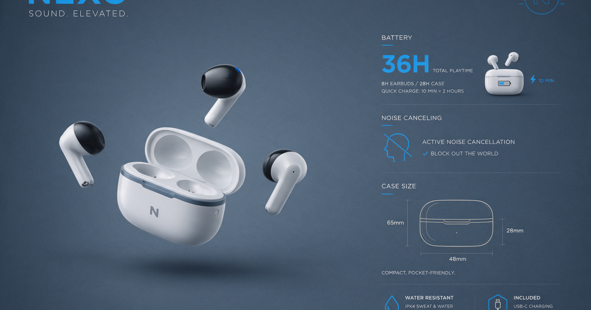
The tech version is the most direct. Dark background. Bright callouts. A clear spec panel. It works because the product is the point, not the scene. If the item has a battery, case, screen, or sensor, this layout makes those details look intentional instead of technical clutter.
For a different on-site angle, the Miniature Worker Effect shows how a strong visual hook can carry the whole ad. That post uses scene drama. This one uses facts and layout. Both are built to stop the scroll, just in different ways.
To build your own version in VideoMagic, start with the product, pick one promise, and keep the labels short. Then test the look on a few categories. Skincare, sneakers, coffee, and accessories all need different balance, but the structure stays the same. The goal is simple: make the product feel clear, useful, and worth a click.
Make this for your own products in VideoMagic
Turn a plain product photo into scroll-stopping video — free to start.