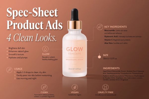
4K product images do not have to look stiff, slow, or overworked. The new wave of fast, high-detail image tools makes it easier to test a hero shot, a color story, and a campaign crop before a studio booking. The useful change is not the megapixel number. It is how quickly a seller can judge whether a look makes a product feel worth stopping for.
MiniMax released H3-Image on November 10 with 4K output, image editing, and support for multiple references. That matters for ecommerce because a clean product frame can now become several distinct ad directions in one working session. This roundup turns that launch into four looks worth testing for a next campaign.
4K product images work when the idea is simple
More detail does not fix a weak concept. It makes weak styling easier to spot. Start with one clear job for the image: make the texture tempting, make the material feel premium, or leave enough quiet space for a paid-social headline. Each look below has a single visual decision. That keeps the frame useful across product pages, launch emails, vertical crops, and short motion edits.
1. Citrus splash for skincare and drinks
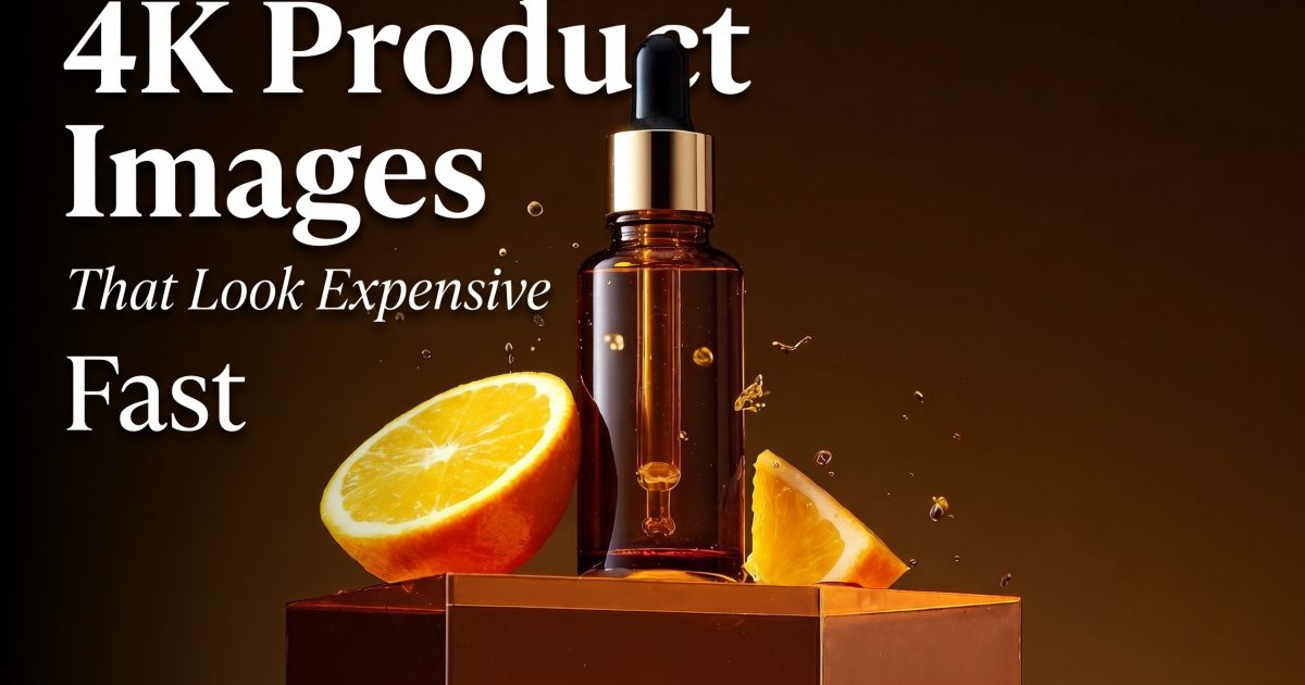
A warm serum bottle, a cut orange, and a few suspended droplets do more than say fresh. They give the eye three things to travel between: glass, fruit, and light. The image still feels like a product shot, not a busy lifestyle scene. This is a smart direction for vitamin C, fragrance, sparkling drinks, and anything with a bright ingredient story.

Keep the product label zone uncluttered. Put the fruit low in the frame, then let the droplets add energy around the edges. If the product has a strong brand color, switch the acrylic plinth to that color and keep the background darker. The contrast helps small details hold up when the image gets cropped to a mobile ad.
2. Amber showroom for a quieter luxury signal
Not every premium frame needs a high-contrast splash. An amber-on-amber setup makes a product feel collected and deliberate. Glass, metal, and translucent acrylic all reward this treatment because they catch small shifts in light. It works best when the prop list stays short: one plinth, one supporting ingredient, and one source of specular detail.

Use this direction when the product needs to feel giftable or editorial. The background should fall away behind the hero item. Avoid adding type inside the image. Save the message for the ad layout, where it can change without rebuilding the photograph.
3. Chrome foil for tech accessories
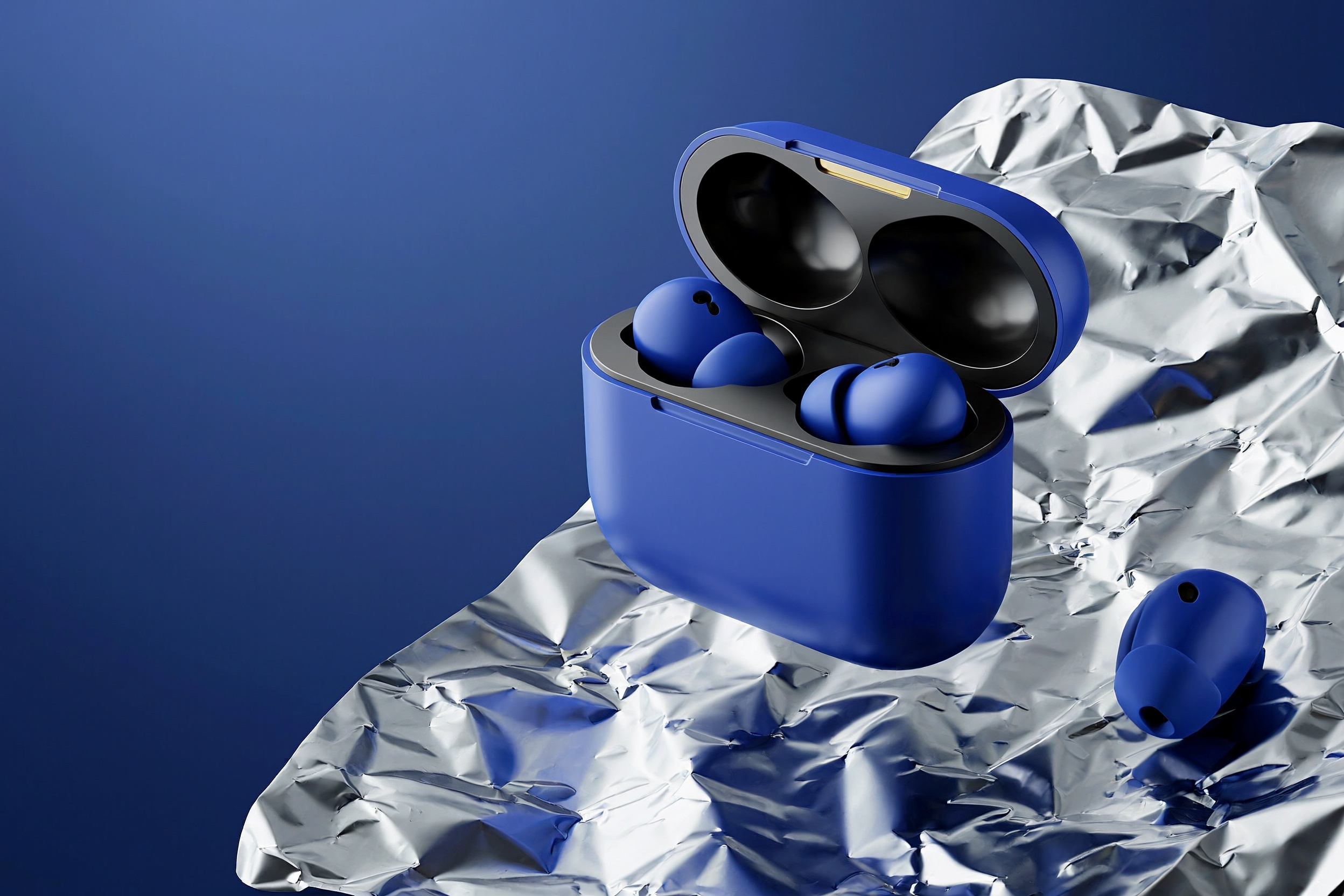
Chrome foil is a fast way to give compact electronics more scale. Its ripples create highlights that suggest movement, while the product stays crisp and calm. The trick is to treat the foil as a surface, not a costume. One dominant color on the item and a small metallic palette around it will read more expensive than a rainbow of reflections.

This look suits earbuds, beauty tools, watches, chargers, and compact home tech. The product outline has to stay true. Before posting, compare the generated frame with the real SKU and fix any drift in buttons, ports, logos, or proportions. A strong ad cannot compensate for a customer receiving something different.
4. Negative-space hero for faster ad testing
The most practical of these 4K product images may be the one with the least happening around it. A centered item with generous clear space gives a social team room for a price, a benefit line, or a seasonal hook. It also makes one master frame easier to crop into square, portrait, and wide placements.
Ask for the product to sit slightly off center rather than dead center. That small shift creates an obvious home for copy. Try a dark version and a pale version of the same setup. The winner is often not the prettier image. It is the one where the product remains clear at a glance.
How to test these looks without making a content pile
Pick one real product photo with accurate packaging. Build four directions around it, then choose one use per direction: a product-page hero, a launch ad, a retargeting creative, or an email banner. This keeps the test honest. Do not generate twenty near-identical frames and call it exploration.
New tools can make the first pass fast, but the selection step still belongs to the brand. The MiniMax H3-Image launch details describe its 4K generation and reference-based editing, while Recrafts H3 testing notes show why an image frame and a later motion pass are different jobs. Use the speed to test direction, not to skip product checks.
For a simple first round, score each image on three questions: Does the product look accurate? Does the message still fit after a mobile crop? Does the image look distinct from the last campaign? If the answer is no, adjust the art direction before making more versions. VideoMagic can take the strongest still and turn it into short product motion for the next creative test.
Make this for your own products in VideoMagic
Turn a plain product photo into scroll-stopping video – free to start.