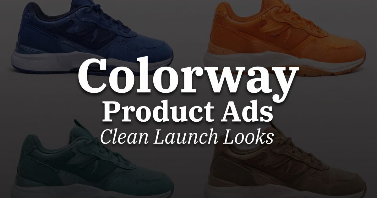
Colorway product ads work when one SKU feels like a launch, not a listing. The layout gives each color its own moment and keeps the brand system tight. That matters for sneakers, bags, bottles, earbuds, and any product that ships in more than one shade.
The four examples below use the same idea in different moods: warm, dark, airy, and grid-based. The goal is simple. Make the color feel like the headline.
Colorway product ads: why the layout sells
The best colorway product ads repeat the same angle and change the color story. That keeps the eye on the difference, not the setup. A shopper sees the same product as a family, which makes the whole line feel more complete.
It also helps with launch-day clarity. One image can lead with the hero color, another can show a darker option, and a third can make the palette feel soft and seasonal. That rhythm works in social ads, collection pages, and email banners because the layout stays familiar while the shade changes.
The examples here were generated with Qwen Image 2.1. The model is built for clean image generation and editing, which makes it handy for product frames that need sharp edges and consistent styling.
4 colorway product ads that feel ready to launch
Each frame below pushes the same idea in a different direction. Use the one that matches the mood of the drop.
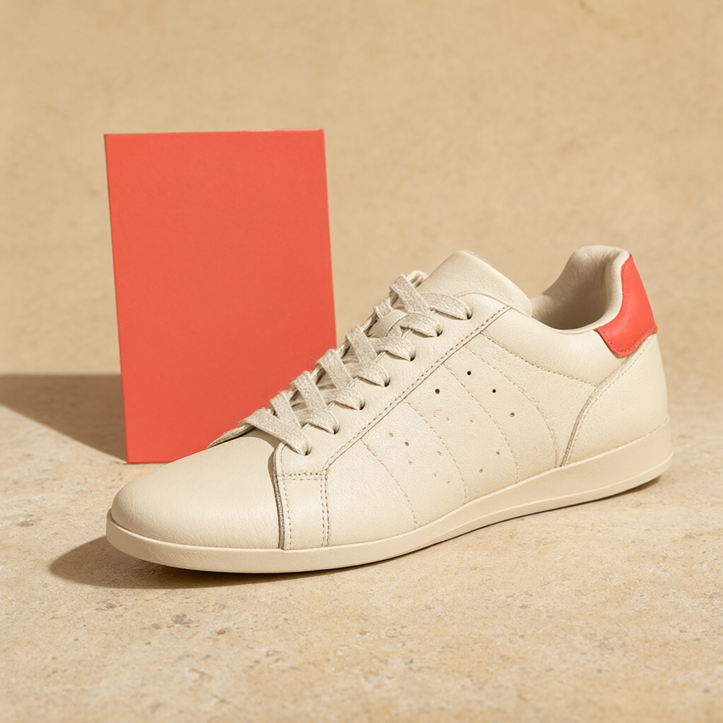
The warm version feels easy to shop. Cream leather, soft daylight, and one accent card keep it polished without making it stiff. This is the kind of frame that works when the brand wants a calm launch, not a loud one.
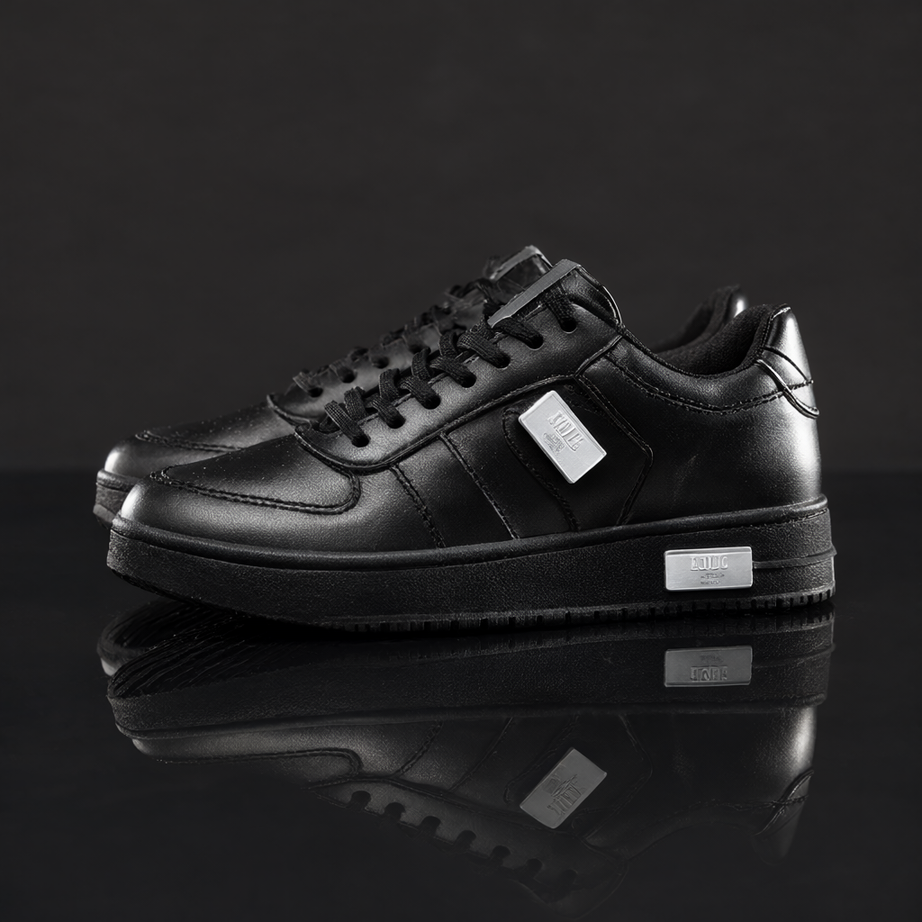
The dark version feels sharper. It reads like a premium drop page or a late-night campaign tile. The reflection gives it weight, and the silver notes keep the frame from disappearing into the background.
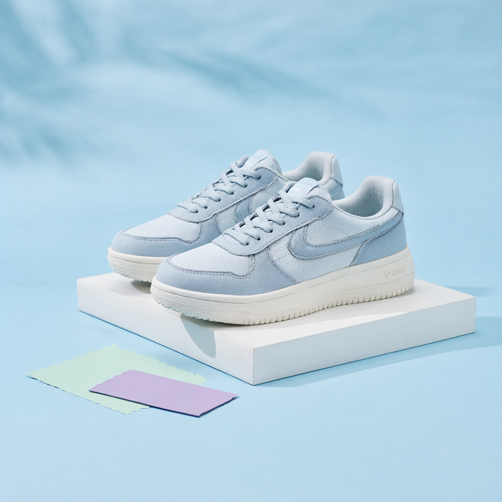
The pastel option feels brighter and more social-first. It gives the product room to breathe and makes the colorway story feel fresh. This one suits spring launches, creator campaigns, and homepage hero slots that need a lighter touch.
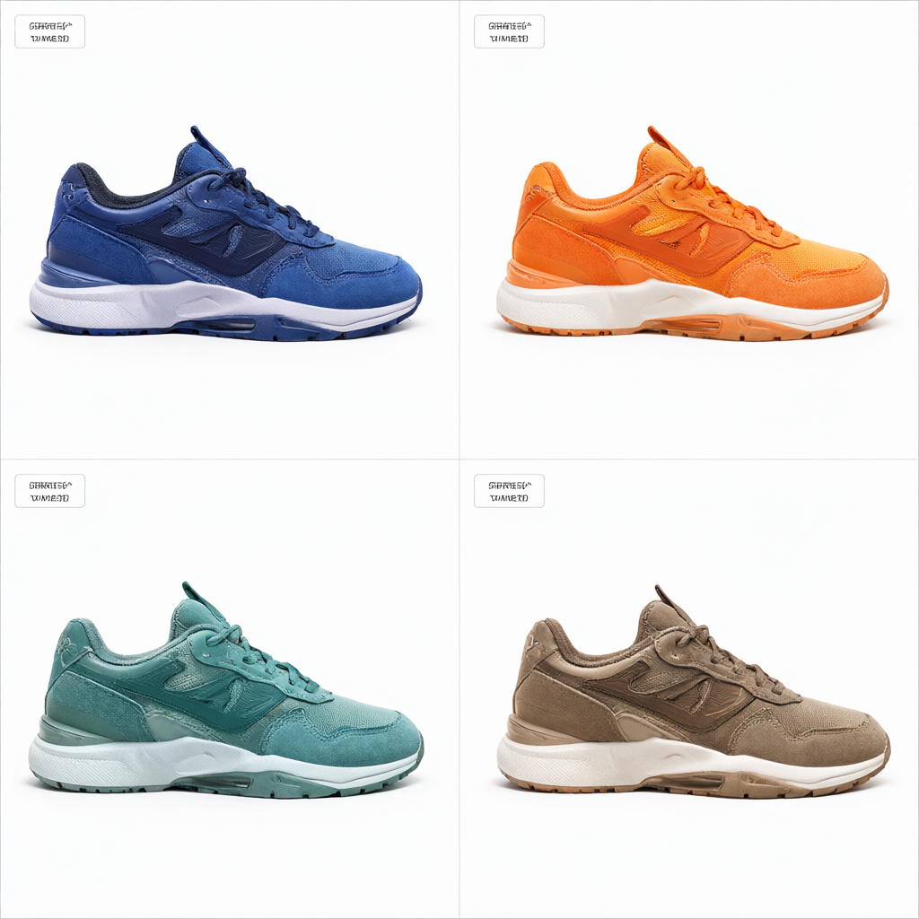
The grid version is more functional, but it sells the range fast. It works when the buyer needs to compare options quickly. That makes it useful for collection pages, paid search, and any page where the goal is to show choice without adding clutter.
How to build the look fast
Start with one fixed camera angle. Keep the lighting style steady across every version. Then change only the color cues, the backdrop, or one accent prop. That small discipline keeps the line feeling connected.
- Use one product shape across the whole set.
- Keep the shadow direction the same.
- Swap only one or two accent colors at a time.
- Leave enough empty space for crops, badges, and headlines.
If the brand has three or four colors, it helps to treat each one like a chapter. The hero color gets the warmest frame. The darker color gets the highest contrast. The lighter color gets the most air. The final board can show the full set in one glance.
That approach also keeps the ad system flexible. One frame can become a carousel slide. Another can become a PDP banner. A third can sit in an email header without feeling like it came from a different campaign.
For reference, the Qwen-Image-2.1 GitHub repo and the ComfyUI workflow guide both point to the model’s 2K output, editing support, and alpha-channel features. Those are the bits that matter when a product drop needs matching visuals instead of random one-offs.
Where the format fits best
| Look | Best use | Why it works |
|---|---|---|
| Warm hero | Launch email, homepage banner | Feels friendly and easy to buy. |
| Dark reflective | Premium drop, paid social | Feels sharp and more expensive. |
| Pastel pedestal | Creator campaign, seasonal edit | Feels light, modern, and scroll-friendly. |
| Four-panel board | Collection page, comparison tile | Shows choice fast without extra copy. |
Colorway product ads do one job well. They make the product line feel coherent. That is enough to lift the whole drop. When the system is clean, the shade becomes the story.
Make this for your own products in VideoMagic
Turn a plain product photo into scroll-stopping video — free to start.