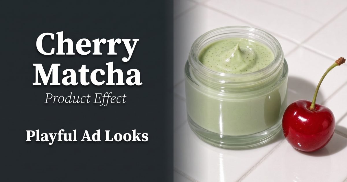
Cherry matcha product effects turn a plain packshot into a bright, slightly cheeky ad frame. The formula is simple: a soft matcha green base, one glossy cherry-red accent, and light with enough bite to show every highlight. It works especially well for skincare, lip products, drinks, small accessories, and any product with a clean label that needs a quick visual hook.
The pairing feels fresh because it balances cool and warm color. Green keeps the set calm; red creates the stop-scroll moment. The trick is restraint. Let the product stay central, use one or two props, and give the label a clear patch of negative space.
Why cherry matcha product effects work
Color contrast does a lot of the work before a viewer reads a caption. Designers use color relationships to create contrast and mood, a useful starting point when choosing a prop palette for an ad frame. A cherry-red detail against muted green reads clearly on a phone screen without needing a busy backdrop. For a quick color check before shooting, use Adobe’s guide to the color wheel to test nearby reds and greens rather than picking shades at random.
Keep the green pale and creamy, closer to whisked matcha than neon lime. Let the red stay lacquered and deep. That difference in finish matters as much as the colors: powdery paper or matte foam makes the cherry look wetter and the product look more tactile.
1. Color-pairing packshot
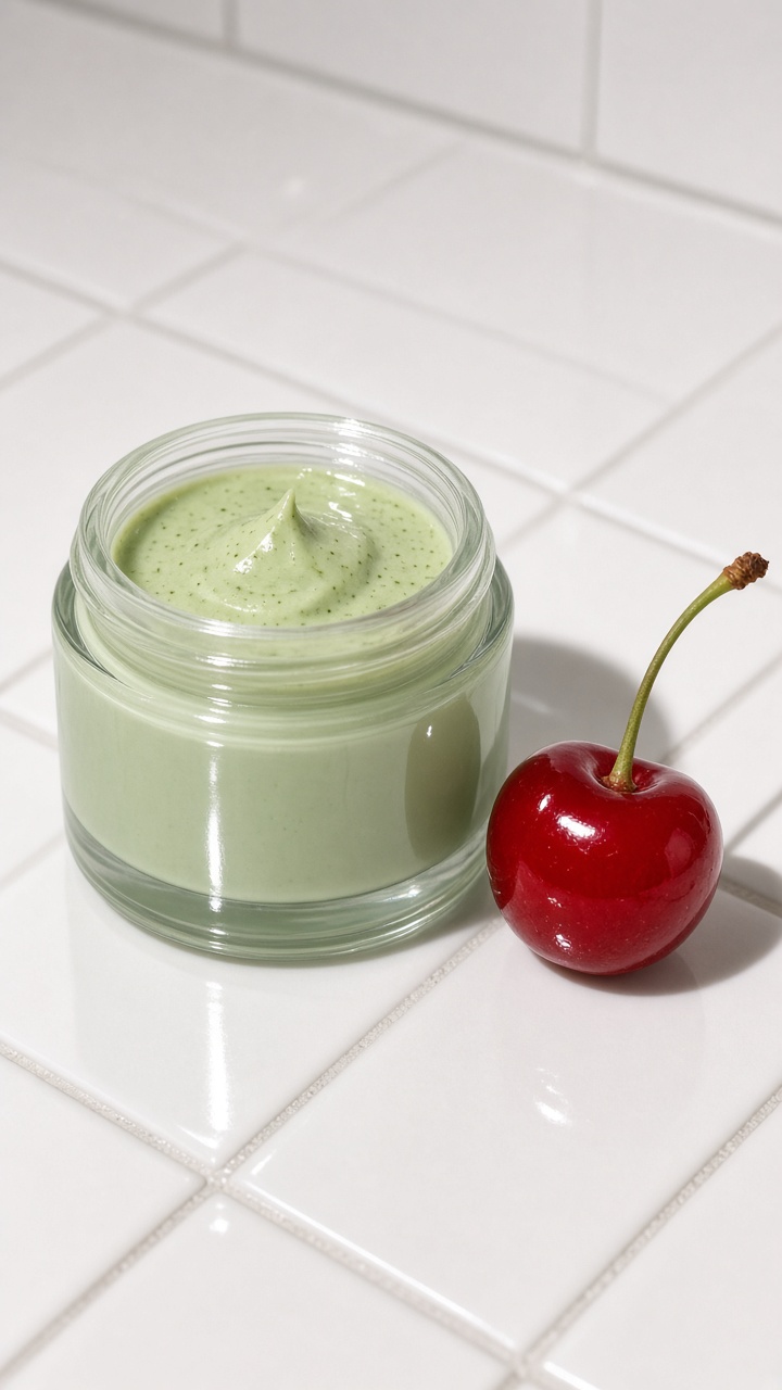
Start with the cleanest version of the trend. Place the product slightly off-center on a pale green sweep. Add one cherry near the front edge and one blurred shape in the back. The front prop supplies scale; the back prop adds depth without competing with the label.
How to make it
- Photograph the product straight on first, with the label parallel to the camera.
- Use a matte green board or cloth with no visible texture.
- Set one glossy red cherry just outside the label area.
- Leave a bright blank area above the product for a price point or short headline.
Example prompt: “Pale matcha green studio sweep, centered frosted skincare jar with a readable blank label, one glossy dark red cherry in the foreground, soft side shadow, clean editorial product photo, vertical ad composition.”
Use this look for product launch tiles, collection pages, and the opening frame of a five-second reel. If the product already has a red logo, reduce the prop count to one. Two reds can make a small image feel crowded.
2. Flash-lit beauty close-up
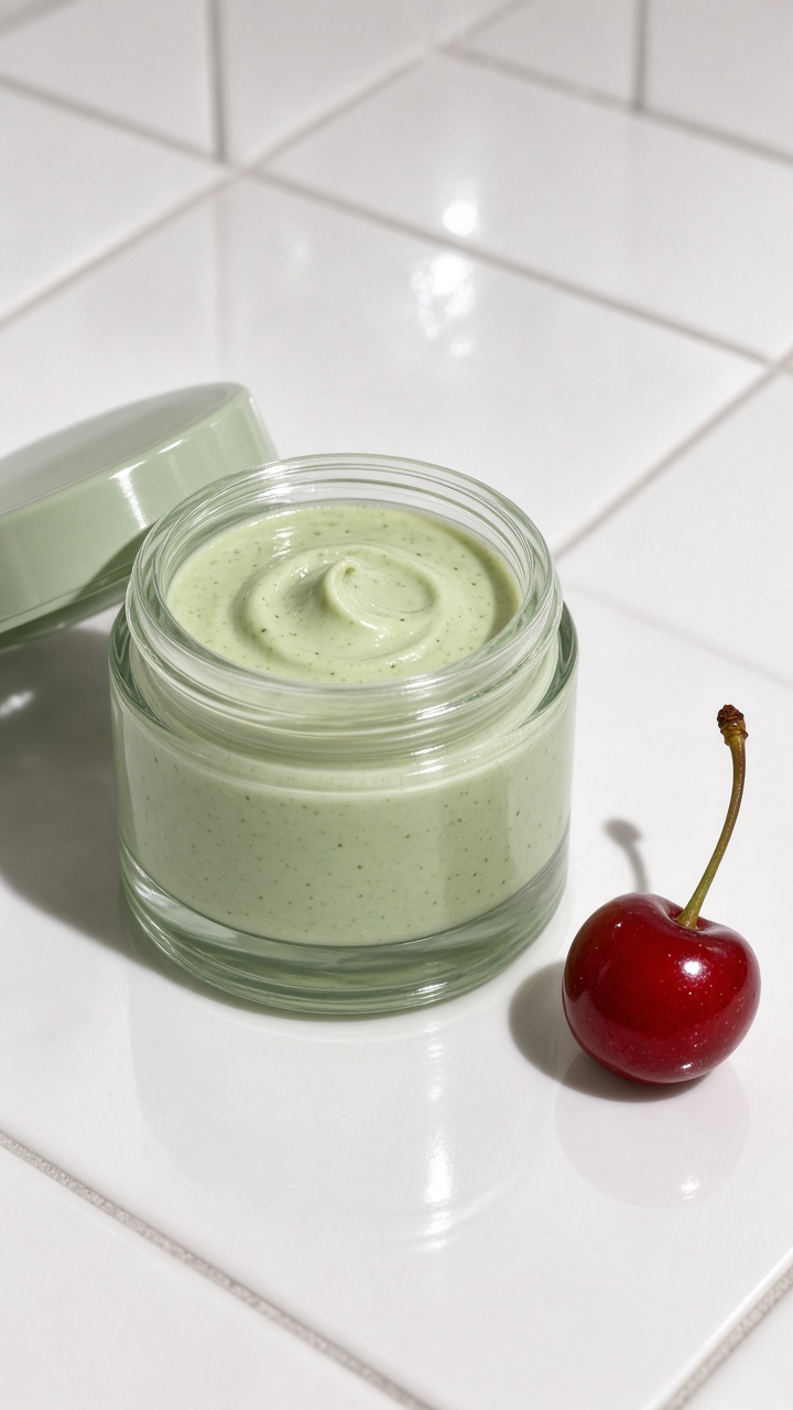
For more energy, move in close and use a hard, frontal light. Direct flash creates sharp shadows, bright specular spots, and a casual camera-roll feel. It suits lip gloss, nail color, travel-size skincare, and accessories with reflective packaging.
How to make it
- Crop tightly enough that the product fills at least half the frame.
- Keep the flash angle near the lens so the shadow falls cleanly behind the product.
- Use a red acrylic bead, cherry, or lacquered ribbon as the shine cue.
- Protect white text and small labels from glare by turning the pack a few degrees.
Example prompt: “Tight direct-flash product photo of a matcha green lip balm tube, glossy cherry red sphere beside it, crisp hard shadow, candid digicam texture, high shine, vertical social ad.”
For video, begin on the flash highlight, then make a short push-in toward the logo. Keep the move under one second. That gives editors a punchy cut point for a creator voiceover or product benefit text.
3. Cherry-drop texture shot
This version leans into texture. Use a green cream, powder, or paper surface and introduce one red liquid detail: syrup, gloss, tinted gel, or a single drop-shaped acrylic piece. The contrast feels playful, but it can still look premium if the product remains dry and spotless.
How to make it
- Build the texture around the product instead of underneath the label.
- Use a pipette or spoon for controlled drops; test on a spare surface first.
- Light from the side to catch the edge of the liquid.
- Retouch only distracting splashes, not every imperfection.
Example prompt: “Premium matcha green cosmetic compact on a textured green surface, one glossy cherry red gel drop curling beside the compact, side-lit macro product photography, readable front label, no hands.”
Use it for ingredient-led skincare, lip launches, and food-adjacent products. Avoid real fruit juice around cardboard packaging or unsealed products. A prop should add the idea of freshness, not create a reshoot.
4. Mini cherry market shelf
Build a tiny retail world around the hero product. A green checkerboard base, small red shopping basket, or a hand-written price card can turn a standard packshot into a playful campaign image. This is the most graphic of the four looks, so simplify the packaging and use a short message.
How to make it
- Choose one set device: a grid, basket, receipt, or produce crate.
- Repeat red only twice: once in the prop and once in a small background detail.
- Keep the product taller than every prop so it stays the hero.
- Leave room for a 3-to-5-word offer, such as “fresh skin reset.”
Example prompt: “Playful miniature market set for a pale green face cream jar, matcha green checkerboard floor, tiny cherry red basket and two cherries, direct flash, editorial ecommerce ad, clean readable label, portrait format.”
This look works for seasonal promos, bundle announcements, and social carousels. Create three crops from the same set: a full scene, a tight product crop, and a prop-only detail. That gives a small brand enough material for a week of posts without making every asset look identical.
Production tips for a clean result
Shoot the product alone before adding props. That backup frame helps with retouching and makes it easier to test a new layout later. Match the camera angle across every look so a carousel feels intentional. Vertical 4:5 works well for feed posts; leave extra room above and below if the image may become a 9:16 story or reel cover.
Check the label at phone size. If it cannot be read, move the product closer before adding more set pieces. Keep shadows directional but not black. Finally, make one quiet version with less gloss and one bold version with flash. The quieter frame often wins on a product page, while the flash frame earns attention in social placements.
Make this for your own products in VideoMagic
Turn a plain product photo into scroll-stopping video – free to start.