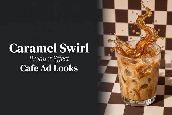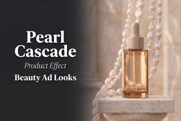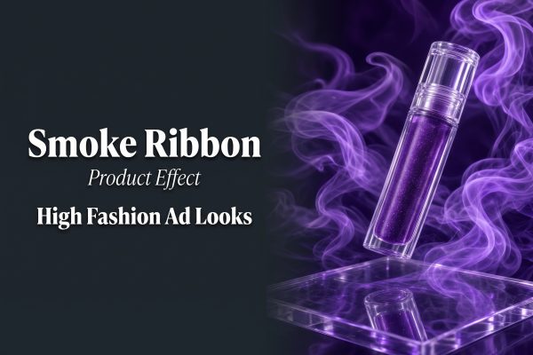
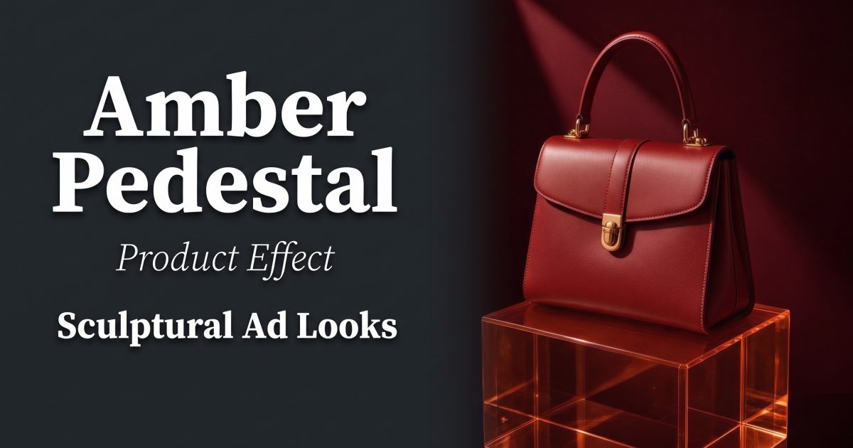
Amber pedestal product effects turn a plain packshot into a small piece of set design. The recipe is simple: a clean product, a translucent warm-toned riser, and light that gives the base a glow instead of making it disappear. It works especially well when a launch needs an editorial feel but the product still has to read clearly in a vertical ad.
In this guide
Why amber pedestal product effects work
Amber makes a product feel warmer before the viewer has read a word of copy. Unlike a plain white plinth, a translucent amber block catches a highlight at the edge and creates a second color field under the product. That gives a compact item more visual weight without filling the frame with props.
Keep the palette tight. A red bag, dark perfume bottle, gold-toned accessory, lipstick tube, or warm metallic device all sit naturally against amber. Cool products can work too, but add a deep charcoal or oxblood background so the warm riser feels intentional. The aim is contrast between materials, not a rainbow of colors.
This setup also earns its place in short-form creative. A static first frame reads as a premium product photo. A slow camera move, light sweep, or small rotation turns the same arrangement into an opening shot for a product reveal. For more scene controls and image references, see the official product-scene model page.
Four sculptural ad looks to try
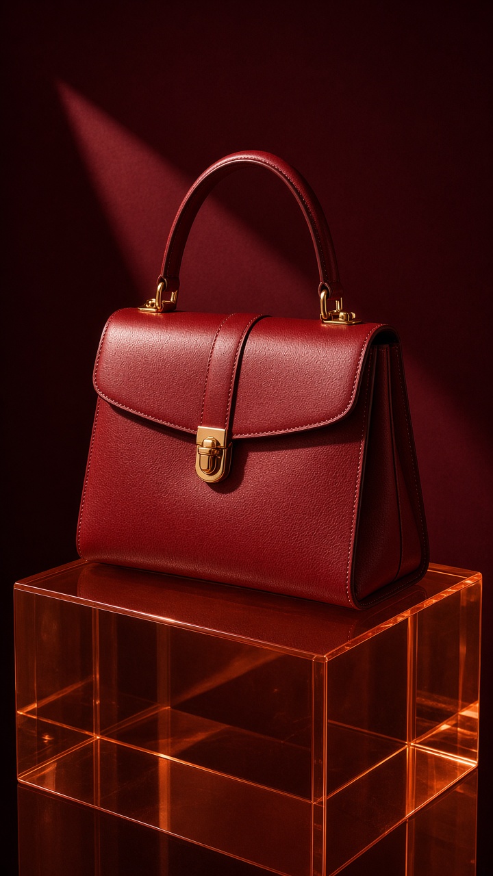
1. Burgundy and amber
Start with adjacent warm shades. Place a burgundy handbag, bottle, or shoe on an amber block against a wine-red backdrop. The colors belong together, yet the translucent pedestal creates enough separation that the product does not sink into the set. Leave a thin rim of light along the top or side of the product.
Use this prompt as a starting point: vertical luxury product ad, burgundy leather handbag centered on a translucent amber acrylic pedestal, deep oxblood studio background, single soft side light, subtle reflections, editorial fashion still life, clean negative space, no text. Replace the handbag with the actual item, but retain the material, background, and lighting language.
Production tip: put the logo-facing side toward the brightest part of the frame. If the packaging has metallic type, rotate it a few degrees instead of aiming it squarely at the light. That small turn keeps glare off the name while preserving the specular highlight. This look fits autumn color drops, fragrance, leather goods, and gift-guide ads.
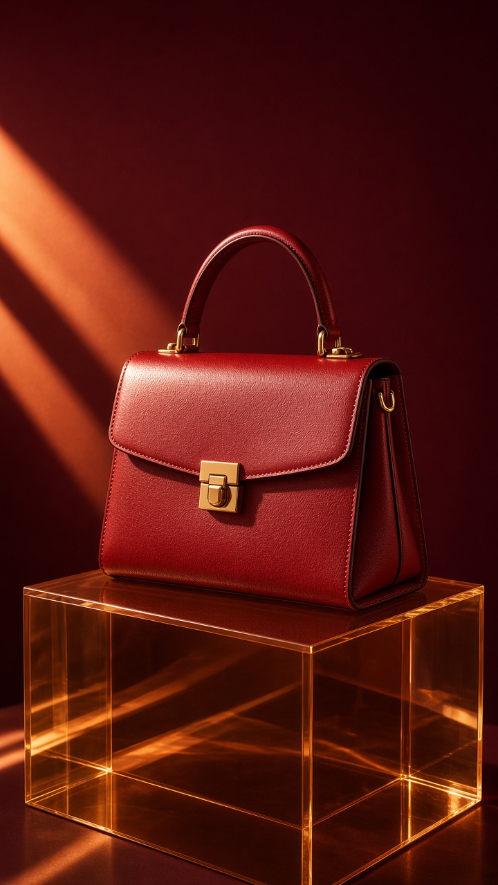
2. Hard-light acrylic
For a sharper result, trade the soft side light for a hard beam. It creates a defined shadow that acts like a second sculptural shape in the composition. The amber acrylic will hold a bright edge, while the product gets a crisp silhouette. Keep the background simple. Texture competes with the shadow.
Try: vertical studio product photograph of a clear fragrance bottle on a thick amber acrylic cube, dramatic hard light from camera left, long clean shadow, dark brown paper backdrop, high-end magazine art direction, realistic glass reflections, no extra objects. Ask for one light direction only. Multiple light sources often flatten the very contrast this look needs.
Set the object slightly back from the front edge of the riser. That gives the shadow room to stretch forward or sideways. Use this version for fragrance launches, premium skincare, jewelry, and black or silver tech accessories. For motion, animate a narrow light sweep across the bottle, then cut to the product benefit screen before the viewer loses interest.
3. Tonal beauty still life
A pedestal does not need to dominate the picture. In a tonal beauty setup, let it support a lipstick, serum, nail color, or compact while one small prop repeats the product color. A sliced citrus shape, ribbon loop, or folded card can add scale, but stop at one supporting element. The product remains the hero.
Prompt: vertical beauty campaign still life, coral lipstick standing on a translucent amber pedestal, one curved coral paper ribbon in the background, warm peach gradient, soft overhead light, refined shadows, close crop, clean advertising composition, no text. Match the supporting accent to a label color rather than guessing a new shade.
Check the crop at feed size. A thin tube can look lost in a wide scene, so frame it close and use the pedestal as a broad base beneath it. This approach works for seasonal collections, shade launches, and carousel cover images where color does much of the selling.
4. Floating hero reveal
Use the pedestal as the landing point for a product that appears to hover just above it. The gap can be tiny. A small band of shadow or reflected light is enough to suggest lift. It adds movement to a still without making the item look physically impossible.
Prompt: vertical ecommerce product hero shot, wireless earbuds hovering one inch above a translucent amber pedestal, burnt orange gradient background, controlled studio light, soft contact shadow, polished aluminum detail, premium launch campaign, no text. Specify a contact shadow. Without it, the product can look pasted into the scene.
This is the strongest option for a six-to-eight-second reveal. Begin with an empty amber plinth, bring the product down into place, then finish with a slow orbit. Keep the motion restrained. Big spins and fast zooms make a sculptural ad look like a template instead of a product story.
How to make the look for an ad
First, choose a product photo with a readable outline. Side profiles, clear bottles, boxes, and structured accessories are easier than busy prints or highly reflective objects. Remove clutter before building the scene. The pedestal should add shape, not hide weak product photography.
Next, pick one amber direction: honey yellow for bright beauty, burnt orange for sport or tech, or red amber for fashion and fragrance. Give the background a darker or quieter version of that color. Then choose either soft side light for a calm editorial image or hard side light for a graphic campaign frame. Do not mix both until the base image works.
Finally, make two crops from the same setup. Use a close vertical crop for Reels, Stories, and paid social. Create a wider crop for a product page banner or email header. The visual stays consistent across the launch, but each placement gets room for copy. Explore more product-ad looks on the VideoMagic blog.
Make this for your own products in VideoMagic
Turn a plain product photo into scroll-stopping video – free to start.