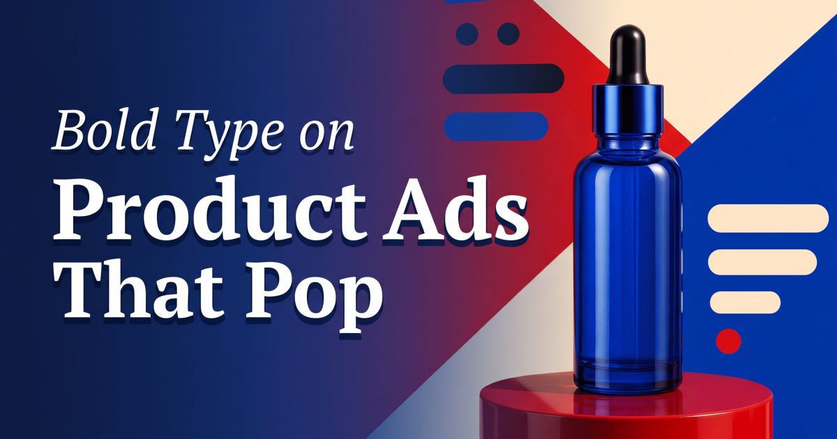
Bold typography product ads turn a product launch into something that reads like a poster before it reads like an ad. One oversized line, a clear product silhouette, and a confident color decision can stop the scroll without a studio set full of props. The trick is restraint: the words create the first impression, while the product stays large enough to answer what is being sold.
For ecommerce teams, this is a practical way to make a product page, launch announcement, paid social placement, and short-form video feel connected. Build one visual system, then adapt it for each placement. The four examples below show where to start and what to avoid.
Why bold typography product ads work
Large type gives the eye a clear route through the frame: claim, product, detail. That is useful on a phone, where a viewer may only give an ad a second before moving on. A short statement also makes the creative easier to remember than a crowded feature list.
Start with one message. New color. Limited run. One product benefit. One mood. If the headline needs a second sentence to make sense, it is doing too much. Let the landing page handle specifications, ingredients, and comparisons.
The product should never become an afterthought. Leave visual space around the packshot, preserve label contrast, and keep the hero object front-facing when recognition matters. Try this prompt structure: premium product poster for a [product], [two to four word headline], oversized condensed serif lettering, high contrast [color] background, centered packshot, crisp studio shadow, clean editorial layout, no logo distortion.
Four poster-style product looks
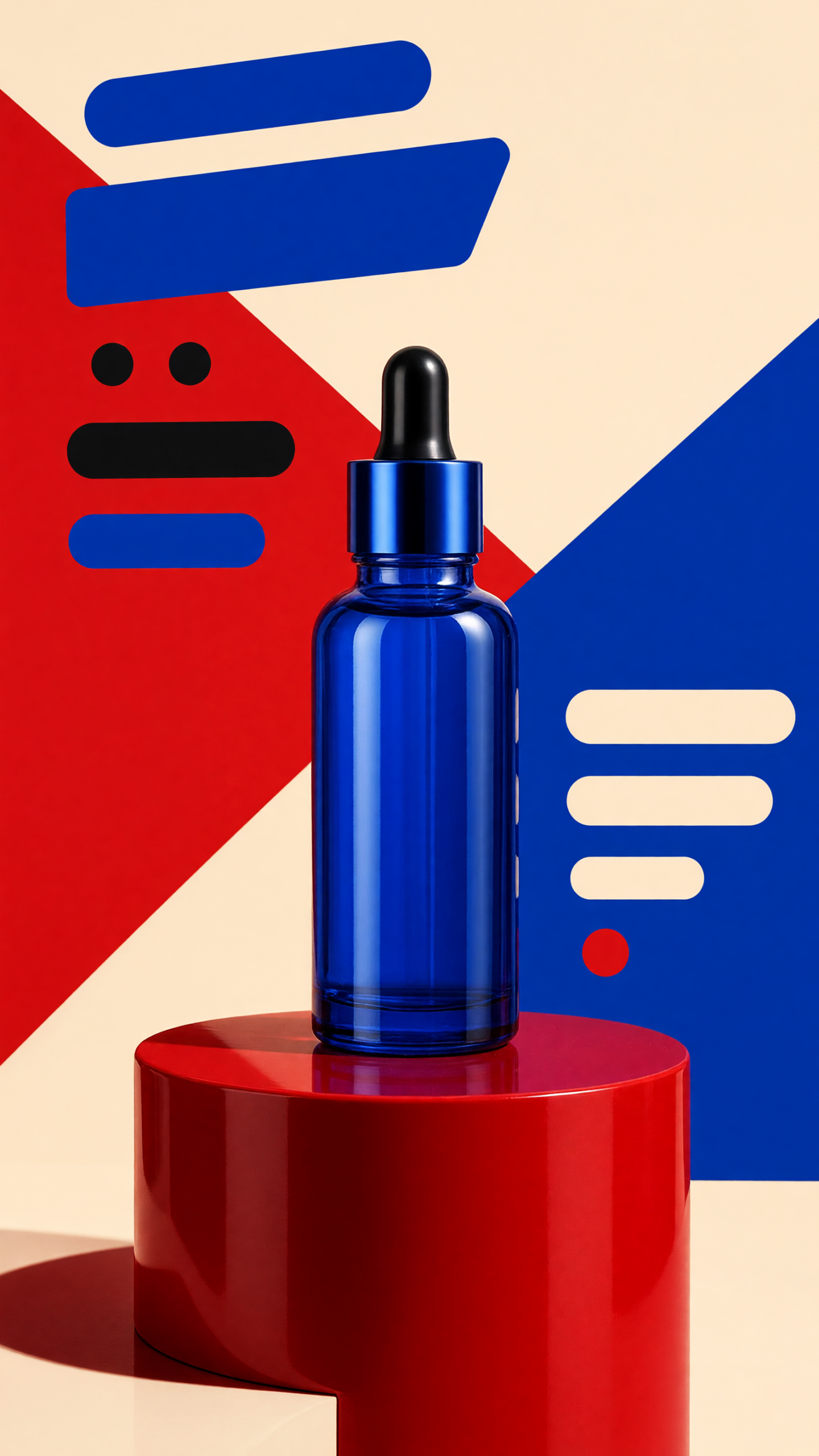
1. The color-block launch card
Choose one saturated backdrop and one contrasting headline color. Keep the product on a simple plinth or flat plane, then make the type feel architectural around it. This look is strong for a new shade, seasonal collection, snack flavor, or beauty drop because the color itself becomes the signal.
How to make it: pull a background color from the packaging, use no more than two type colors, and place the product in the bottom third or dead center. Reserve the headline for the top half. Test the design at story size before adding any smaller copy.
Prompt idea: electric orange product poster for a coral lip balm, headline NEW SHADE in oversized cream serif letters, sculptural packshot, sharp graphic shadow, minimal editorial campaign, vertical composition.
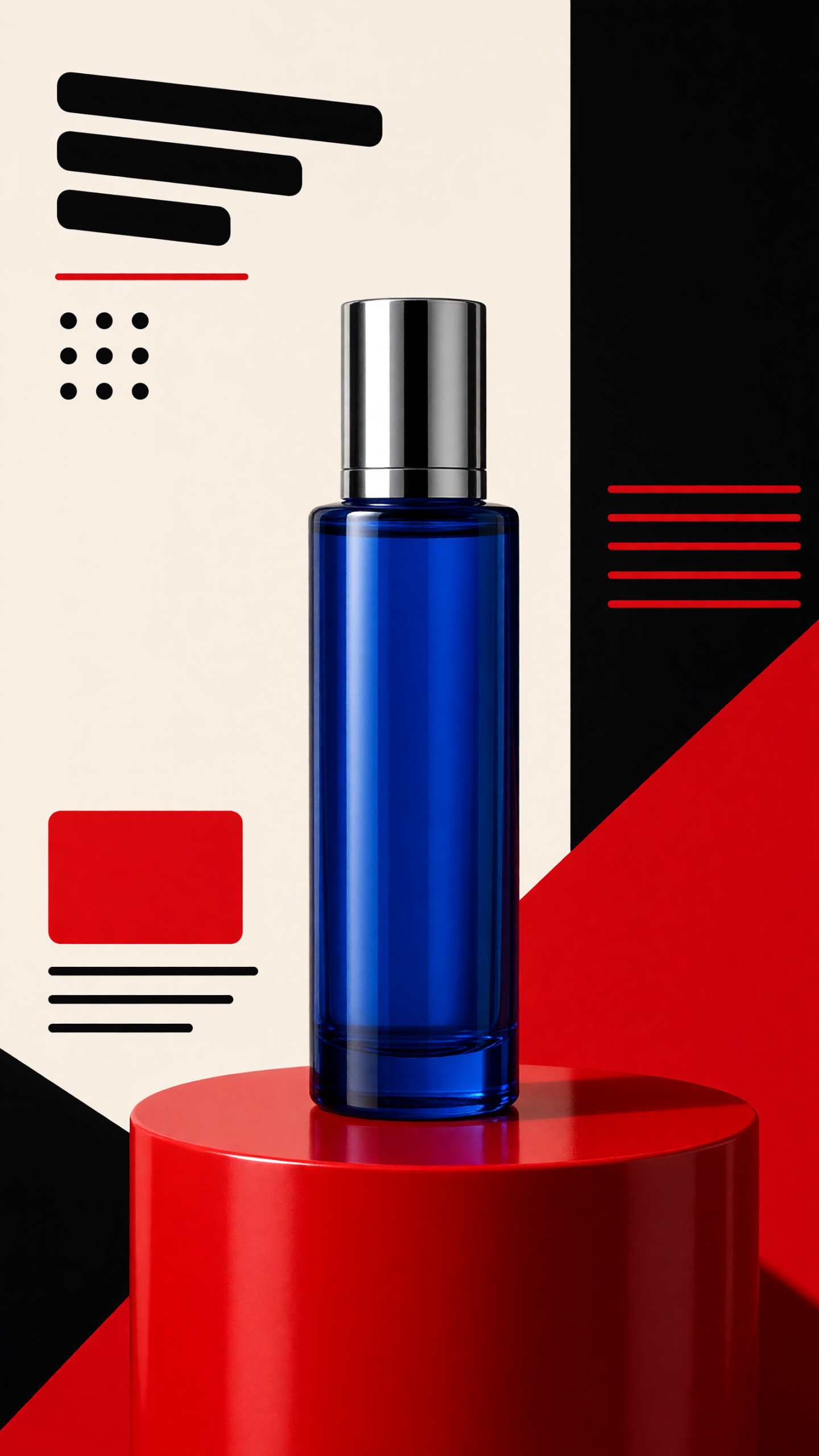
2. The product-as-punctuation look
Here, the product interrupts the headline: a bottle rises through a letter, a sneaker overlaps a word, or a tube replaces a vertical stroke. It feels clever without requiring a complicated set. Use it when the shape is distinctive enough to recognize quickly.
How to make it: pick one word only, use a bold typeface with generous spacing, and let the product overlap one or two characters rather than covering the full message. Keep a clean edge around the object so the text remains readable. This is especially useful for fragrance, drinkware, headphones, and footwear.
Prompt idea: graphic poster ad for a matte black fragrance bottle, word NIGHT in huge white letters, bottle interrupting the letter I, deep charcoal background, high-end magazine lighting, sharp readable typography.
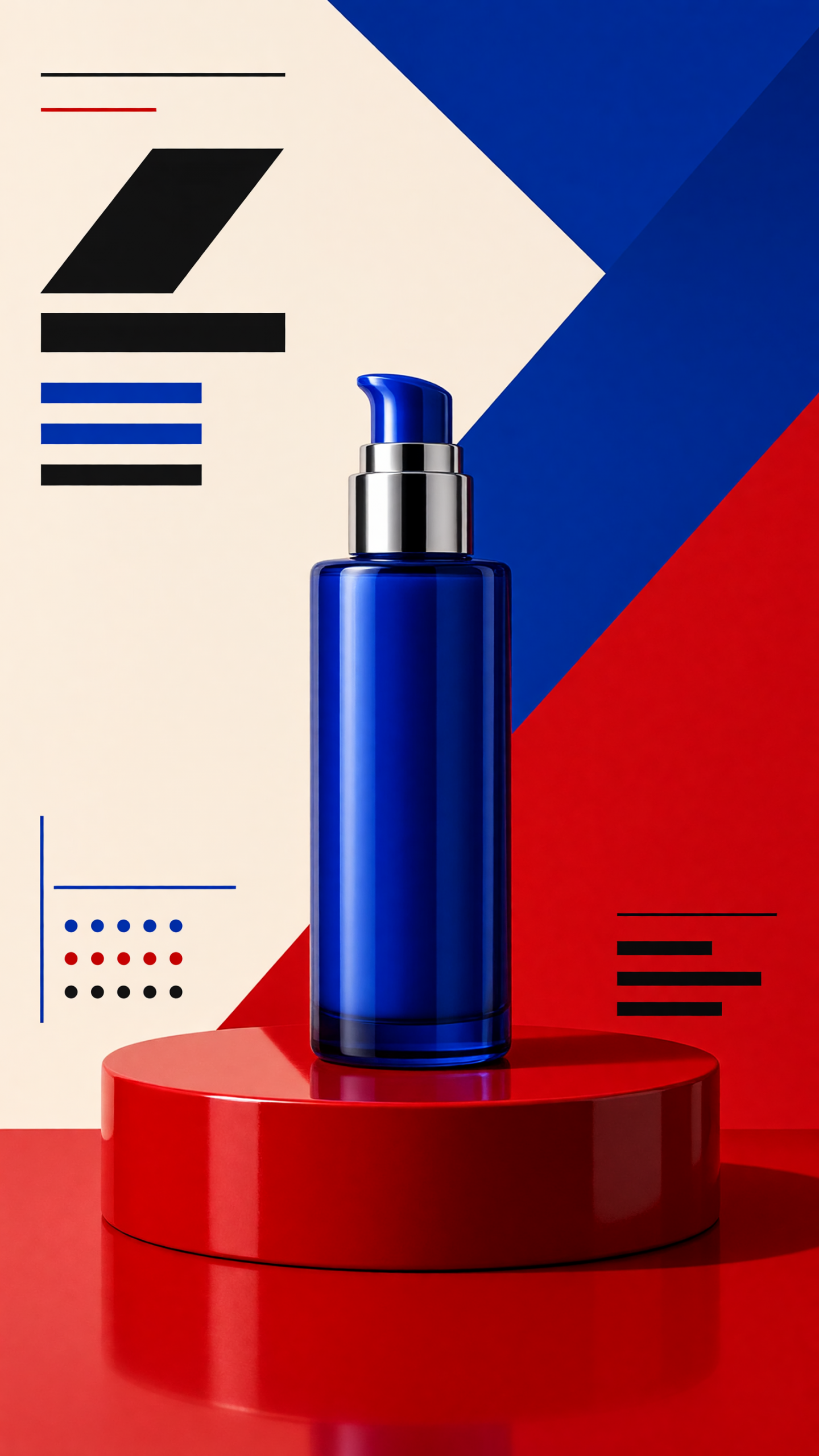
3. The stacked benefit poster
Use stacked words to make one benefit feel physical. Think LIGHTER, COLDER, SOFTER, or BUILT TO LAST. Each line should be short and the product should sit beside the statement, not below a paragraph. This is a better route for an evergreen paid ad than a campaign line that depends on a trend.
How to make it: write three benefit candidates, then choose the one a first-time shopper can understand without context. Shoot or generate a packshot with a little side angle and leave negative space where the stack will sit. Keep the proof point small and low in the frame.
Prompt idea: clean ecommerce poster for an insulated tumbler, stacked headline STAYS COLD, ice blue field, product at right with condensation, bold sans serif type, premium direct flash, simple retail campaign.
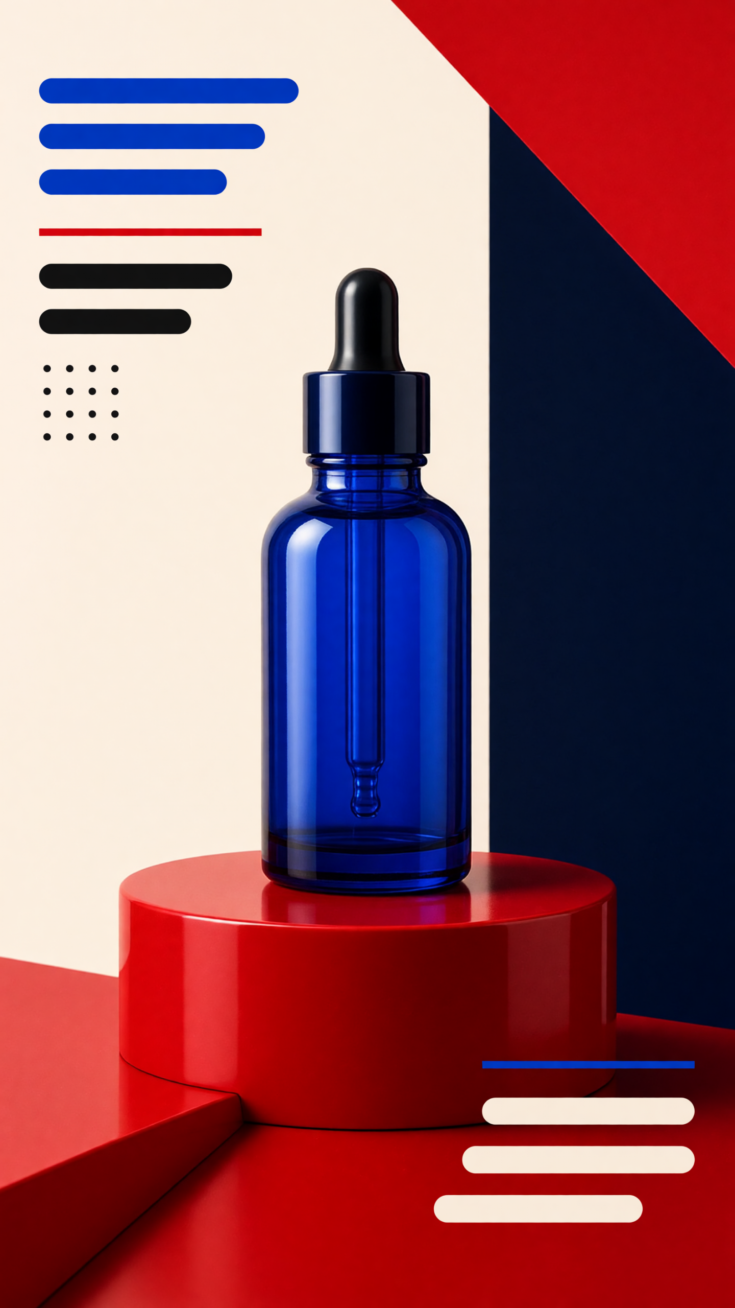
4. The editorial limited-drop look
A dark field, smaller italic supporting type, and one large serif phrase can make a limited product feel more considered. Use this style for a collaboration, gift set, premium colorway, or preorder. It works best when the product has a tactile finish that catches directional light.
How to make it: limit the palette to black plus one accent, use a soft gradient rather than a busy scene, and make the date or drop note secondary. The goal is mood first, product clarity second, not mystery for its own sake.
Prompt idea: luxury limited drop poster for a chrome skincare jar, black-to-plum gradient, headline AFTER DARK in large white serif lettering, subtle italic subtitle, dramatic side light, refined editorial product photography.
Production rules for bold typography product ads
Design for the smallest placement first. A headline that works in a vertical reel cover usually scales to feed and display placements; the reverse is not always true. Keep essential words away from interface areas, leave room for cropping, and check that the product name is not hidden by the type.
Create two variations for testing. Change one thing at a time: headline versus no headline, color-block versus dark editorial, or centered product versus off-center product. Watch saves, thumb-stop rate, and product-page clicks rather than judging only by likes. A strong poster-style ad should make the offer clearer, not merely louder.
For more visual directions, browse VideoMagic effects and templates.
Make this for your own products in VideoMagic
Turn a plain product photo into scroll-stopping video — free to start.